Planning board
The planning board component is the heart of the application. This component is divided intoto a set of functional areas:
- The scheduling grid
- The resource grid
- The top bar
- The bottom bar
This distinction is easy to notice:
In the center is a paged grid that contains all the information about the resources. It allows you to filter, sort and visualize everything a planner needs. Every resource in the grid also has a planning timeline at its disposal, which shows the appointments the user is authorized to access. Planners can create, update and delete appointments in this timeline, either directly or indirectly. To support these core elements of the component, a series of extra features are available in the top and bottom bar, which include navigation and state management.
In what follows is a detailed descriptions of these elements.
Top bar features
The top bar of the component provides an array of buttons and switches. In this section we will have a closer look to see what they are and what they do. On the left hand side of this bar, you will see something similar to this:

In order of appearance on the image above, these are their functions:
| Capability | Description |
|---|---|
| Search | Filters the resource grid's visible columns by the keyword entered in the search box 1 |
| Fit to screen | Shows the planning of the selected date range in one view 2 |
| Start Date | Sets the start day |
| Range | Sets the range of the visible scheduling view |
| Views | Selects the planning view |
| Appointment height | Sets the height of appointments in the planning board |
| Date range picker | Change the timeline's date range |
On the right hand side of the toolbar, you will see something similar to this:
In order of appearance on the image above, these are their functions:
| Capability | Description |
|---|---|
| Collapse and expand resource rows | Shrinks the appointments to fit on one row or stack overlapping appointments. |
| Toggle containers visibility | Hides or shows the rendering of the containers in the planning board. |
| Ignore or apply calendar mode | Planning board level configuration to apply or ignore resource calendars |
| Clear resource filters | Clear all resource filters |
| Shift | Go to the previous or next time range |
| State | Manage the state of the component's state |
| Export | Export to PDF |
Search
The search bar works just like the other search bars in Dime.Scheduler. Using the text that was entered in the search box, a filter will be created for all visible columns in the resource grid. When there is at least one match for that query, the resource will be included in the result set.
For example: when the search 'Ma' is used in the following resource grid, two items will be returned:
| Resource Display Name | Resource Type |
|---|---|
| John Doe | Consultant |
| Joanna Hope | Machine |
| Max Power | Consultant |
Even though Joanna Hope contains no 'Ma', the resource type does ('Machine'). Likewise for the third resource, where there's no match for resource type but there is one in the display name column. If there had been only one visible column, then the resource grid only would have shown the third resource (since there's no 'Ma' in Joanna Hope).
| Resource Display Name |
|---|
| John Doe |
| Joanna Hope |
| Max Power |
Fit to screen
This toggle button is all about squeezing and expanding the scheduling grid into one view so no horizontal scrollbars are required to consult the entire planning of the selected date range.
Start date
This menu provides a few options regarding the scheduling grid's starting date. Choosing one of the following options will set the start date of the date range you want to view on the planning board:
- Today
- Start of week
- Start of month
Apart from these default presets, you can always select a custom start date and a custom date range via the date picker component.
Note: when you open or create a planning board - by launching the application, opening a profile or by opening a planning board via Add new planning board - the default values are taken from the 'standard view settings' which are stored in the user profile.
Range
The range menu has a number of presets for the visible scheduling range on the planning board:
- Day
- Week
- Month
Selecting any of these options will trigger the date picker to update its range with the selected option. For example, when the month range is selected, a month will be added to the start date of the planning board, which might possibly cause the component to load the appointments for the added dates.
The range and view menus work independently from each other but they work well together. A range for a day works well with the day view, just like a (working) week view works well with the month range.
Note: when you open or create a planning board - by launching the application, opening a profile or by opening a planning board via Add new planning board - the default values are taken from the 'standard view settings' which are stored in the user profile.
Views
The views menu determines the time unit of the planning board. Put in other words, it has a few presets that configure the timeline's lowest level of time. The following options are available:
- Day
- Week
- Work week
- Month
Day view
The day view shows the timeline on an hourly basis. By default, every hour of the day is rendered, the user profile allows to restrict the start and end date.

The top level in the header of the timeline will help you to keep an overview on the date.
Week view
The week view goes one level higher than the day view. It shows the days (and the day number), grouped by the week.

This is a useful view for high-level planning and capacity reporting.
Work week view
The work week view is essentially the same as the week view, but as the name suggests, the weekends are not included.

Month view
The month view is useful when you want to make a planning spanning several months. The lowest level in the timeline are still the days but it groups by month, rather than week:

Appointment height
The height of the appointments on the planning board can be configured and varies from one line up to five lines. This feature is accessible by clicking on this button in the planning board's top toolbar:
When '1 row' is selected, the appointments will look like this:

In contrast, five lines adds a significant height to the appointments:
Date range picker
This toolbar option is essentially the same as the date picker component, but made accessible inside the planning board component.
Ignore or apply resource calendars
This is a toggle button which overrides the global resource calendar planning mode. This allows for granular management of the calendar mode on the planning board level. As it is quite an extensive feature, there is a whole post dedicated to it. Read more about it here.
Clear resource filters
Resource filters can be set in various locations. Obviously, there is the component that filters the resources in the planning board. There are also filter action columns in the open and planned tasks grids, the Gantt chart, and ultimately, the planned tasks component also allows you to show the resources that you selected in the grid. Let's zoom in on what this means. It says there are two types of resource filters that can be accessed in different components. This sounds confusing, but it doesn't need to be.
First of all, there is the "Resource Filters" component. This component provides a powerful query builder to filter the set of resources on the planning board. This allows the planner to look for a resource with a certain skill set or qualifications to carry out the task the planner wants to schedule. This is the resource-first approach. There is also a second way. The task-first approach enables the planners to set requirements on the task. For example, there is only a handful of pilots in the world that can land a jumbo jet on St-Maarten's Princess Juliana airport. A task filter can be helpful in finding a pilot in the workforce that is qualified and available. This is what the filter icons at the beginning of each row in many grids are for. However, underneath the surface this filter has exactly the same effect as the resource filter component, except that these task filters are preconfigured rather than composed on the fly. The second resource filter type has a much simpler concept. The planned tasks grid shows a list of appointments and its assigned resources, which the planner can leverage to quickly filter out the other resources. Thus, the planner can have a closer look at the planning of these resources without having to search for those in the planning board. In other words, it is a simple shortcut to show the resources that are selected in the planned tasks grid.
All these actions might make you wonder why you can't find the resource you are looking for. This button will clear all external filters, or the filters that are not part of the planning board's component, which means that filters on the columns will still be applied after clearing the other filters. Beware of the tooltip on this button, it will show you exactly which filters are currently active on the planning board.
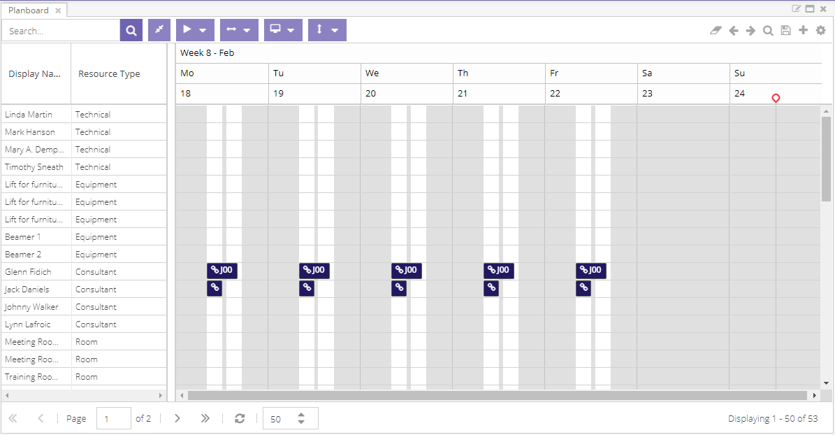
Highlight appointments
Via the planned tasks grid, it is possible to select a range of appointments and highlight them on the planning board. In case you missed it, please read this first.
In addition to the connection between the planned tasks grid and the planning board, there are a few additional capabilities at the user's disposal. Two contextual items are shown when the appointments are highlighted in the planning board:  .
.
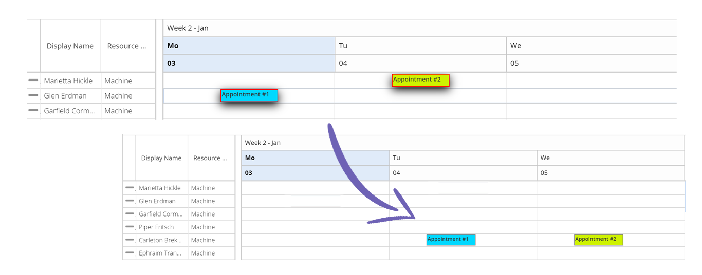
The first item toggles the visibility level of the highlighted appointments. Not only does it toggle the visibility, it also toggles the editability of the other appointments: to prevent unwanted modification, the appointments that are not highlighted cannot be dragged or resized in the planning board. When the highlight feature is activated by the planned tasks grid, the drag-select feature will only consider the records that were selected in this grid. In other words, it will ignore the appointments that were not selected. In the example below, only two items will be selected.
The stop button resets the feature entirely: no appointments are highlighted and all appointments are restored in their original state. The planned tasks grid must be consulted to activate this feature again.
The visibility toggle button in the scheduler affects the scope of the drag-select feature: when the toggle button is activated, only the highlighted appointments will be considered. When it is deactivated, all appointments on the planning board are in scope of the dragged area.
Shift dates
Two sets of arrow icons will shift the planning board's time range with the applied unit.
This function is connected to the date picker (and its subsequent connected components like the pivot grid or the Gantt chart). Shifting back and forth the planning board will update the date picker, which will trigger the other components to update as well. This guarantees that all components are pointing to the same dates.
Shift 1 day
The and icons will shift the timeline one day up or down.
Shift range
The and icons will shift the timeline with the current date range.
A unit is a variable thing and is determined by the selected date range, which can be set using either the date picker component or the range option. Ultimately it is the range that will determine the unit for shifting to the next period. For example, if the date picker indicates a five day range, then the shift arrows will move the visible scheduling range to five days earlier or later.
This capability is also accessible with the shortcut keys SHIFT + and when the user is working on the planning board. In other words, when the user is working in the open tasks grid, these keyboard combo's will not work.
Planning board state
Just like the other components, the planning board is stateful. Planning boards can be modified and loaded on the fly. For more information, have a look at the grids documentation.
The planning board has a few more features than the grids, and thus it has more elements in its state. See the state section for more about this.
Export
When you click the PDF export button, Dime.Scheduler will take a snapshot of the planning board and export it as a PDF file. There are a few parameters which allow you to tweak the output 3:
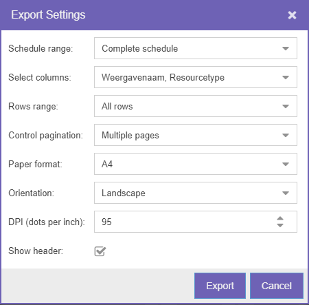
The first field lets you select the schedule range. You can choose to include the complete schedule, a date range or the visible schedule. Similarly, you can select a row range, which can either be 'everything' or just the 'visible range'. This window also allows you to add or remove resource fields. In what remains are print settings: you can choose the page format, orientation, the pagination control and whether to add a header to the page.
The actual export is done by an export server. Once the document is ready, a modal window will be prompted to save the file. You will find that the output is very similar to the planning board:
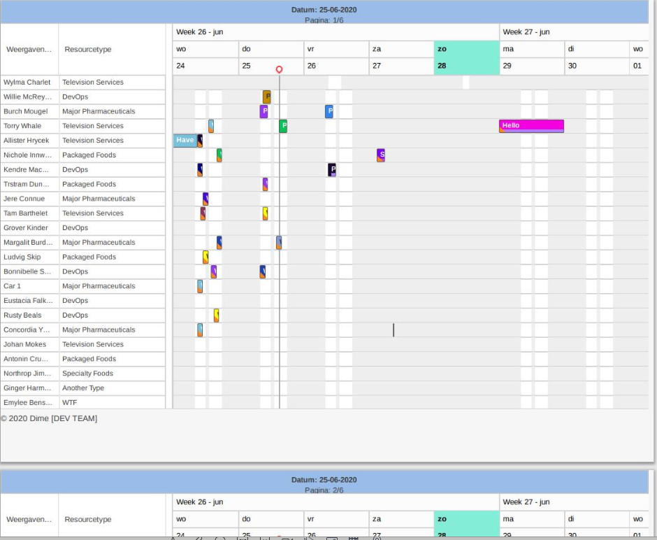
Because the export feature and the planning board are so tightly integrated, we recommend that you create a dedicated layout of the planning board which is optimized for printing.
Bottom bar features
The bottom bar is like all the other grids in the application. It is a section dedicated to paging the resources, allowing massive scalability of the application with many thousands of resources.
The paging toolbar contains the following elements:
- Go to the first and last page
- Go the previous and next page
- Select a page by number
- Refresh the page
- Select the page size
It is important to know that the resources are paged, not the appointments.
Viewing appointments
Visual indicators
Every appointment is rendered individually according to its properties. Besides the subject, a few extra visual indicators describe the appointment.
The video below showcases the functionality of some of the indicators:
Category
Visualized as the color of the appointment. This option can be driven by the back-office application and the meaning of each color can be chosen when setting up the application (e.g. order type, status, truck load, etc.).
Time marker
Visualized as the colored horizontal bar on the appointment. This option can be driven by the back-office application and the meaning of each color can be chosen when setting up the application (e.g. order type, status, truck load, etc).
Importance
Visualized as the exclamation mark or arrow at the start of the appointment bar. This option can be driven by the back-office application and the meaning can be chosen when setting up the application (e.g. importance, priority, urgency, etc.).
Notification
Visualized as the colored vertical bar on the appointment. Indicates if there are existing notifications for the appointment (coming from the back office) in the notifications component.
The color depends on the severity level of the notification:
- Red in case of errors
- Orange for warnings
- Blue for info messages
Each severity is represented in the notification bar, if such a notification is present. This gives the planner an instant overview which type of messages exist for the selected record.
This  has at least one error message. This
  has at least one error message and one warning message. Finally, this
  has at least one error, one warning and and one informational message.
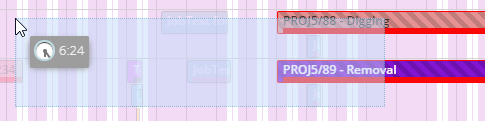
Multi-assignment
When there's more than one resource for an appointment, it'll be indicated with this indicator:

Linked appointment
The chain icon indicates that this appointment was automatically generated by the Gantt chart. When a task in the Gantt task has a resource assigned to it, Dime.Scheduler will automatically create a planning for this task and for this resource. Any changes to this task will subsequently be reflected in the planning board. This icon then is a warning that changes to this appointment will be overwritten by the project's planning.
Tooltips
A series of tooltips are displayed depending on the action that is being performed on the appointment:
-
When dragging the appointment across the planning board:

While dragging, the appointment is already validating if the drop can be made. For instance, when the appointment is bound to a task with requested dates or when a resource type can only have one of its resources assigned to an appointment.
In case of an invalid drop, the tooltip will be different:
 and the drop will be rejected.
 -
When hovering over the appointment:

-
When hovering over an empty time slot:

Appointment details
Selecting an appointment in the planning board will trigger the details component to update its fields with information about the appointment. This enables you to quickly scan its properties without having to open the editor. The same grid can be displayed in a window using the Details menu item in the context menu.
Manipulating appointments
An appointment or event is the graphical representation of the allocation of a task to a resource on the planning board. There are many ways to interact with appointments, as will be explained in this section.
| Capability | Description |
|---|---|
| Creating manual appointments | Create appointments manually in the planning board |
| Drag & drop open tasks | Plan tasks through drag and drop |
| Modifying appointments on the planning board | Modify the duration, dates and resources on the planning board directly |
| Modifying appointments via the editor | Update appointment details via the editor |
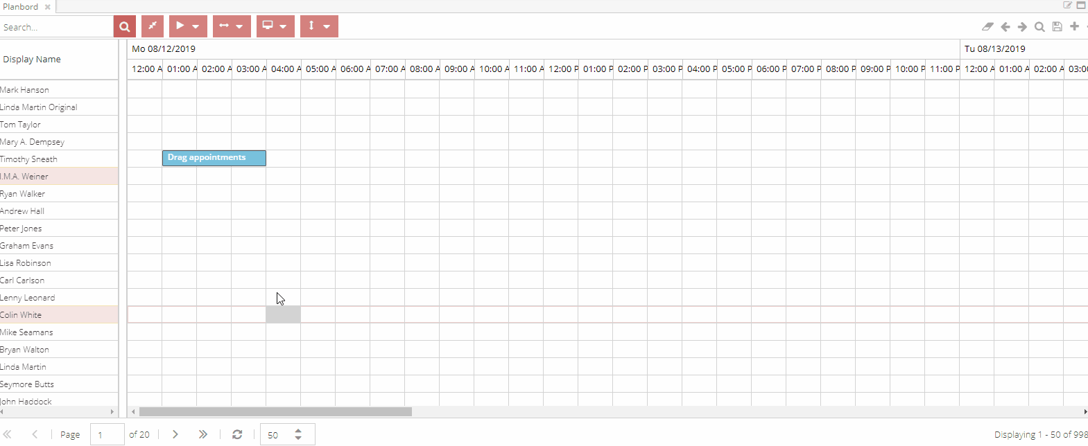
Creating manual appointments
The default flow in Dime.Scheduler is that jobs and tasks (originating from the back-office applications) are converted into appointments (in Dime.Scheduler) which are then sent back to the back-office applications. However it is possible that planners want to create appointments that are not backed by tasks or jobs. These are called manual appointments and can be created in two ways:
The first way is via the context menu. By right clicking on an empty cell in the planning board and selecting the 'New' option, the appointment editor will be opened. The planner just needs to enter a subject and then the record can be created. The duration of the appointment that will be populated by default depends on the view that the planner is currently working in: a time slot in the day view equals one hour whereas in the other views it is one day. Dime.Scheduler will use the start date that you selected and it will add the duration of one time slot to calculate the end time of the appointment. Obviously you can change these values afterwards in the appointment editor.
The second way is to do a drag create operation. To do this, click and hold and start dragging your mouse to the right. When you release the click, the appointment editor will be prompted. Just like the previous way, the resource and dates are populated by default using the contextual information. The only required field now is the subject, which unlocks the save button. All of this is depicted in this screen capture:
Modify appointments on the planning board
Appointments can be manipulated by dragging and dropping the record on the planning board.
The appointment's duration can be modified by dragging the appointment from either side using the handle at the edge of the appointment:

When the duration is correct but the dates aren't, planners can drag the appointments to different dates:

The targeted drop location doesn't even have to be for the same resource. You can assign an appointment to a different resource by dragging the appointment to the resource of choice. When dropped, this appointment will now be assigned to a different resource. However, when the SHIFT key is pressed at the beginning of the drag operation, the appointment's assignment planning mode will be changed from 'replace' to 'append'. When you update an appointment and assign it to a different resource, the resource will be added to the appointment's assignments, indicating that these resources will perform the task together.
It is important to know that this operation will not create a new appointment. Instead, the appointment will add the resource to the assigned resources list, the underlying appointment remains the same.
The appointment editor
The appointment editor - or the appointment card - contains all the details of an appointment, and is split up in different tabs. It is available only in the planning board component and can be opened in the following ways:
-
For existing appointments:
- Using the context menu on an existing appointment and selecting the
Edititem - By double clicking on the appointment
- Using the context menu on an existing appointment and selecting the
-
For new appointments:
- Using the context menu on an empty slot and selecting the
Newitem - After creating a new (manual) appointment with the drag and drop feature
- Using the context menu on an empty slot and selecting the
The first tab - the appointment details - groups the record's metadata whereas the second tab focuses on the resources for that particular appointment. All subsequent tabs are appointment templates which are managed by the administrator.
There is also a combobox that reveals additional features to create a recurring appointment. Read more about recurring appointments here.
Appointment Details
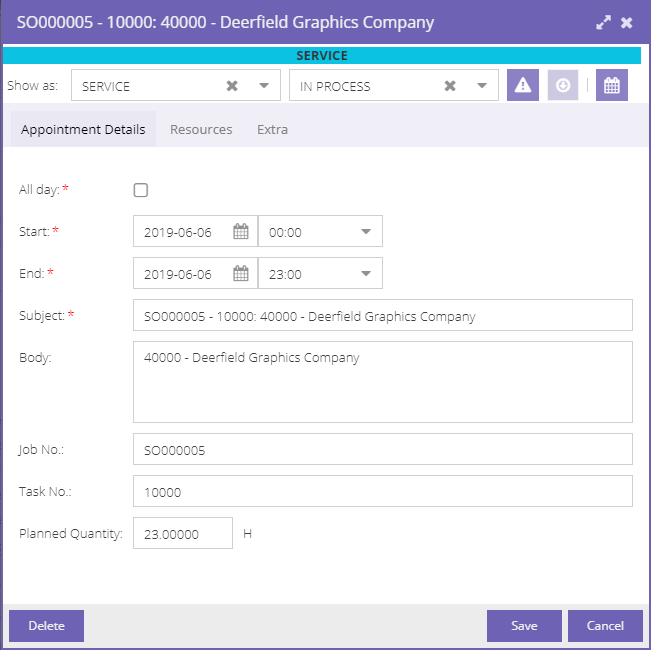
At the top you can modify the following fields:
- Category
- Time marker
- Importance
- Ignore calendars
The categories and time markers the user gets to see when he opens the combobox will depend on his permissions. Indeed, administrators can assign categories and time markers to users and users groups. Note that there is an extra visual aid above the editor's submenu, showing the category and its color across the appointment card.
Likewise for the fourth item - the ignore calendars button - which will only be displayed if the administrator has switched on the calendar mode.
In the appointment details tab you can change:
- Date and time
- The subject and body of the appointment
You can also view the job or task the appointment is linked to and consult the capacity of the assigned resources.
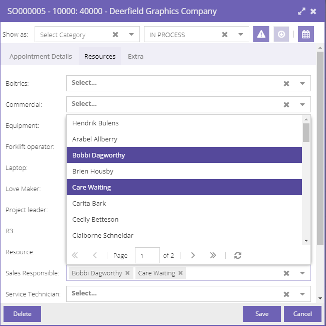
Resources
In the resources tab, you can select resources from the different resource types to link multiple resources to a single appointment. If allowed - i.e. configured in setup - you can select more than one resource from a resource type combobox.
Appointment Templates
As mentioned earlier, you may have additional (custom) tabs on the appointment card. These are added via the setup of Dime.Scheduler and are specific to your organization. You need to consult with one of the application managers to know the use of each of those fields.
Drag and drop open tasks
The last way to manipulate appointments is through the open tasks grid. By dragging a task from the grid and dropping it on the planning board, Dime.Scheduler will convert the task into a scheduled appointment. This conversion reveals a few additional features.
Data mapping�
The conversion involves data mapping. Some of the data from the task entity is copied to the appointment entity. The latter entity also has a reference to the original task. Moreover, a task will be re-evaluated every time a planned task is manipulated - or in other words: created, updated or deleted. This evaluation will determine if a task is still 'open'.
Properties such as the importance or planning quantity are copied to the appointment. Even though it is not visible in the open tasks grid, but a task entity contains a 'Subject' and 'Body' field which are populated using the field templates. These templates use placeholders which are replaced by the task's (and its underlying job) data.
Requested dates
Tasks can be decorated with requested dates, which will only be put into action if the global configuration enables this mode. Requested dates essentially enforce the start and end date of a planned task. The planner is overruled when the configuration is enabled and a task has a "requested start date" and/or "requested end date". If the requested dates are open-ended (i.e. there is no end date), the original duration - which is also specified on the task - will be applied.
Note that these rules are not applicable to manual appointments, which makes sense given there is no task to enforce these rules.
Requested times
The requested times feature is almost identical to the requested dates although with a slightly different scope. Instead of setting the date and time, this feature only sets the times of the appointment. Like the requested date feature, this feature needs to be activated in the global configuration.
When both requested dates and times are activated and when a task has both sets of data, the 'Requested date' fields will be used instead of the times.
Allowed dates
A second set of dates determine the wiggle room of a planned task on the planning board. In contrast to the requested dates, planners may choose the date to schedule a task. When the configuration is set and a task specify 'earliest allowed' and 'latest allowed' dates, the planner will have freedom within a frame. This effectively adds an extra layer of validation. Imagine how you must feel like if your planner dispatches you - a proud owner of a hot dog cart - to the Yankee stadium but only to find out the game finished three hours ago.
These boundaries are enforced even when tasks specify requested dates. This may be problematic as it spirals the task into a deadlock. It is therefore important to check the data before sending it out to Dime.Scheduler.
Note that these rules are not applicable to manual appointments, which makes sense given there is no task to enforce these rules.
The context menu
The context menu - accessible by right clicking on an appointment or an empty slot - exposes a few shortcuts to work with appointments. The following two factors will limit the functions a user will get to see:
- Security clearance
- Whether or not the context is an existing appointment or an empty slot
The total list of menu items is described in the table below:
| Function | Description | Protected by user action | Context |
|---|---|---|---|
| Go to today | Navigates the planning board to the current day | N/A | All |
| Open in day view | Changes the view to the day view and scrolls to the selected cell | N/A | All |
| Details | Opens a window with the appointment details | Appointment | |
| New | Creates a new appointment, uses the selected slot as the start date and the profile's range to determine the duration | New | Planning Board |
| Edit | Updates the selected appointment | Edit | Appointment |
| Delete | Removes the selected appointment | Delete | Appointment |
| Cut | Cuts the selected appointment | Cut | Appointment |
| Copy | Copies the selected appointment | Copy | Appointment |
| Paste | Pastes the selected appointment on the selected time slot on the planning board | Paste | Appointment |
| Special paste | Opens a sub menu with special paste options | Paste | Appointment |
| Toggle calendar mode | Toggles the calendar mode of the selected appointment | Bypass calendar | Appointment |
| Quick actions | Quick actions to postpone or expedite appointments by a day, week, or month | Edit | Appointment |
| Split appointment | Cuts an appointment in two separate appointments | Split | Appointment |
| Disconnect assignment | Either removes an assignment or creates a new appointment for the selected assignment | Split | Appointment |
| Links | Opens a sub menu with links | N/A | All |
| Action URI's | Populates the underlying URI's placeholders and executes the URI | Action URL | All |
There is a second context menu available in the resource grid of the planning board. Like the others in the application, this context menu can be accessed by right clicking on a cell in the resource grid. The options are limited to the list of resource URIs for the resource in the context of the menu. In contrast to action URIs, resource URIs don't contain placeholders and as such they are mere static links to interesting locations that are relevant for this resource. An example would be a link to the resource card in the back-office system.
Copy and paste
Dime.Scheduler offers a number of copy and paste features. If you have worked with a computer at all, this shouldn't be difficult to understand. However, let's go over them for the sake of completeness.
This feature is not limited to one planning board. In fact, you can copy and paste appointments across pages and planning boards. Copying and pasting multiple appointments is also supported: the interval between the selected appointment range remains untouched, altough the date and resource are set according to the current mouse position.
Cut & copy paste
This is a very common tool in other applications so it should be familiar to the reader that cutting an appointment will remove that record in exchange for the pasted appointment in the selected time slot. On closer inspection, you will notice that the cut appointment is shaded.
When copied, the new appointment will still be created but the original appointment will still exist. Note that these features can be accessed in two ways: via the shortcut keys and via the context menu.
Special paste
There are three special paste actions:
- Paste but maintain the same resources
- Paste but maintain the time
- Paste but maintain date and time
The first action will respect the select date and time but the appointment will be pasted on the resource that was assigned to the cut or copied appointment. The other two will inverse this logic and will apply the selected resource but not necessarily the date and/or the time slot that was selected.
Copy/Paste shortcut keys
Here is handy overview of the keyboard shortcut keys regarding the copy and paste features in the planning board:
| Function | Shortcut key |
|---|---|
| Cut | CTRL + X |
| Copy | CTRL + C |
| Paste | CTRL + V |
| Special paste: maintain resources | SHIFT + R |
| Special paste: maintain time | SHIFT + T |
| Special paste: maintain date and time | SHIFT + D |
See this document for an overview of all keyboard shortcut keys.
Split appointments
Appointments can be split in three different ways:
- Keep the appointment but remove the selected assignment
- Create a separate appointment for the selected assignment
- Split the appointment in two
These actions are available through the context menu or via shortcut keys:
| Function | Shortcut key |
|---|---|
| Remove assignment | SHIFT + 1 |
| Disconnect assignment | SHIFT + 2 |
| Split appointment | SHIFT + 3 |
See this document for an overview of all keyboard shortcut keys.
When an appointment is split, it is not necessarily split in two even parts. Instead, just like the copy and paste functions, the cut off point is the mouse's position at the time of opening the context menu or entering the keyboard combination. It is important to know that the snap interval settings may adjust the final value. For instance, when the snap interval is set to 1 hour, splitting an appointment at 10:15 will be adjusted to 10:00.
The end dates of the appointments will not change if the calendar mode is switched on. The total working time remains the same, albeit divided by two separate appointments.
Drag and drop validation
The settings of the application, security level of the users and the specifications of the resources, resource types, tasks and appointments determine the freedom in which an appointment can be dragged and dropped on the planning board. The next subsections will elaborate on these validation rules:
- Appointments must not be locked
- Linked (Gantt) appointments must not exceed the task boundaries
- Appointments must stay inside the boundaries of the allowed dates
- Appointments must take the resource type 'allow multiple selection' setting into account
Locked
An appointment cannot be manipulated if it is locked. This is usually a setting that is set in the back-office systems; it can not be set inside Dime.Scheduler itself. Locked appointments can be recognized by its shaded stripes.
Linked appointments
Linked appointments are the result of the integration with the Gantt chart. When a resource is assigned to task (and the Gantt chart is synchronized), appointments will be created in the planning board.
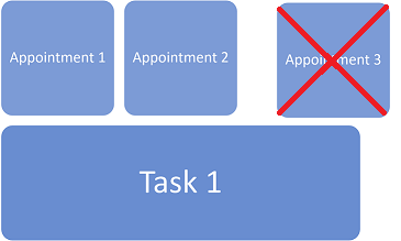
Usually these appointments can be modified freely, but there's one caveat: a linked appointment cannot exceed the dates from the underlying task. This simple sketch shows the boundaries: any appointment may occur anywhere at any time as long as it stays inside the date boundaries (the start and end date of the task).

Dragging an appointment outside the boundary will not pass the test:
Open task constraints
The application configuration contains a setting called "Apply allowed date constraints". The planning board will apply an extra validation rule when this setting is activated.
It is very similar to the previous rule and it is the same rule as this. Appointments can only be planned inside a given time frame when a task specifies "latest allowed" and "earliest allowed".
Resource type
When an appointment is moved to another resource or when an assignment is added (through SHIFT + drag), yet another validation rule is added to the mix. Every resource belongs to a resource type, and a resource type contains a property called "allow multiple selection". The name is rather self-explanatory but when this switch is turned on, it is possible to assign more than one resource of this type to any appointment. In some cases this is not desirable and therefore this switch can provide a solution: if the planner attempts to add a second resource of this type to an appointment, validation will fail and the appointment will not store this modification.
State
As you know by now, this component is stateful. The following elements are stored:
- View
- Columns with order, sorting and filters
- Page size
- Appointment height
- Ignore calendars mode
Standard view settings
You specify the planning boards' standard view settings via the settings cogwheel in the profile area. These settings are stored in the user profile and are used when the application launches, when you open a profile and when you add a planning board to the profile.
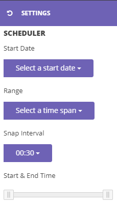
The eagle-eyed readers will have noticed there is an overlap with the start date and range of the planning board component. The same values can be selected here, including the option to set a custom value. For the start date profile field, this can be a positive or negative value starting from the current day (e.g. -1 to start showing the planning from yesterday when starting the application). For the range profile field, only positive values are allowed. The menus in the planning board do the same thing, except that they are stateless, unlike their counterparts in the profile area.
With the snap interval you define the minimum interval with which you move appointments (the entire appointment or the start and end time of an appointment) on the planning board. This makes it easier to drag and drop but also gives you control over a consistent planning.
By default Dime.Scheduler shows all 24 hours on the planning board. Using the sliders, the start and end time can be set.
The settings will be applied immediately on all planning boards in the profile, but the profile itself is not updated automatically. The user needs to save the profile explicitly in order to persist these changes.
Containers
Containers are a useful feature to group appointments and plan the group as a whole. An entire article has been dedicated to guide you through this feature.
Read more
Footnotes
-
This is only available when the administrator has enabled this feature. ↩
-
This is what is called a contextual action. It is only available when certain conditions are met. In this case, this buttons is shown when there are (external) resource filters applied on the grid. ↩
-
See this FAQ article for the caveats of this service. ↩