Details
The details component is the inspector for whatever the planner currently has selected. Grids and the planning board only show a handful of columns at a time, by necessity, but the planner often needs to know one more field about a particular record without expanding the grid layout or leaving the current view. The details component answers that: select something, look at the panel, see every field the team has decided is worth showing.
The list updates automatically when the selection changes. Open tasksOpen taskA task that has not been scheduled yet. It waits in the open task list to be placed on the planning board., planned tasksPlanned taskAn appointment together with the resources assigned to it - the full picture of what will be done, by whom, and when., appointmentsAppointmentA task scheduled to a resource for a specific period - the scheduled instance you see on the planning board., picked in any grid, on the planning board, in the Gantt chart, or in the route sequence grid, all feed the same panel.
How fields show up
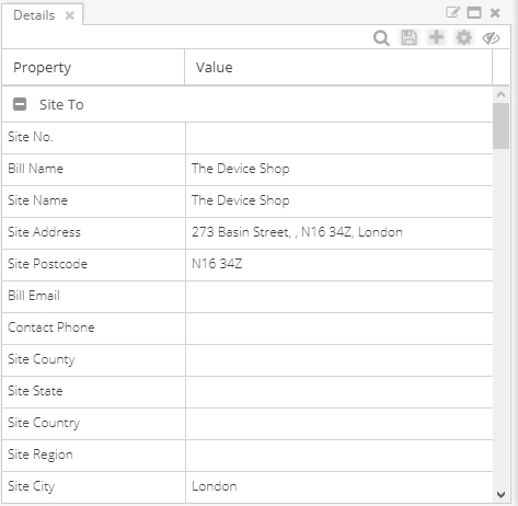
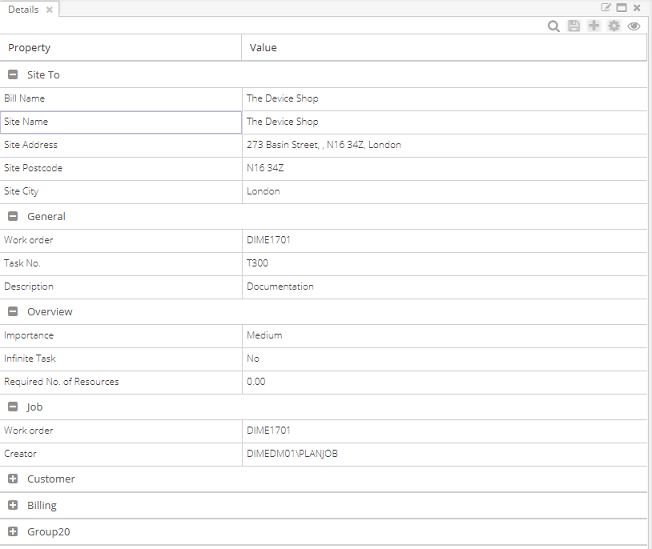
The grid has two columns. "Property" names the field; "Value" holds the actual value for the selected record. The properties stay the same for the entire session: they are the fields the admin chose for the team via the pane layout setup. The values are what change from one record to the next.
That separation is what makes the panel useful. The team agrees once, in the pane layout, what counts as relevant context for the team's work. After that the planner inspects records without making any column decisions, because the columns are already decided.
The list can grow long when the layout is broad. Records routinely have no value for a given property, which produces a lot of empty rows. The fifth button on the toolbar toggles those empties on or off so the planner can choose between completeness (every property, even the blanks) and density (only what is filled in).
Reference
The component has limited state by design. The two columns cannot be sorted or filtered (the property column is fixed; the value column has one value at a time), so the only stateful control is the hide/show-empty toggle. The pane layout itself is the place that persists what shows up here.