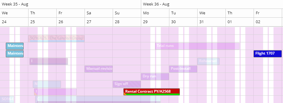
Planned Tasks
The planned tasks component shows the list of all planned tasks or appointments in the shape of a grid rather than a planning board, which allows for easier querying on the appointments. With appointments rendered in a grid - with its corresponding tools - you can easily search for appointments and analyze the planning. For instance, the planning could be grouped by customer and filtered by a team or department, crafting the data in such a shape that it is easy to analyze. Besides data querying it is also possible to perform batch or bulk updates and filter the planning board based on the selected planned tasks.
Apart from a few unique features, this component is similar to the other grids.
Contextual toolbar actions
A number of action icons on the planned tasks grid are only visible when at least one record is selected:
Batch update importance
As soon as at least one record in this grid is selected, the contextual actions will be shown. The importance icon will reveal a modal window in which you can select the importance which must be set for the selected items 1.
This is a protected feature. The 'importance bulk update' user action needs to be assigned to one of the planner's user roles.
Batch update category
As soon as at least one record in this grid is selected, the contextual actions will be shown. The tag icon will reveal a modal window in which you can select the category which must be set for the selected items 1.
This is a protected feature. The 'category bulk update' user action needs to be assigned to one of the planner's user roles.
Batch update time marker
As soon as at least one record in this grid is selected, the contextual actions will be shown. The bulls eye icon will reveal a modal window in which you can select the time marker which must be set for the selected items 1.
This is a protected feature. The 'time marker bulk update' user action needs to be assigned to one of the planner's user roles.
Filter resources planning board
The planned tasks grid contains the same resource filter capabilities as the open tasks grid. However, given this grids contains the list of appointments, it has more data than the open tasks grid. Clearly, one such property refers to the resource themselves.
The following two actions are also contextual, which means they will be activated when at least one planned task is selected. In fact, one record represents an assignment of an appointment, so there is always a resource represented in a planned task. And this is when these buttons come into play: .
This feature can be useful to show the entire planning of all resources that have been allocated to a certain project. Clicking the filter icon will result in a planning board that only shows the resources that were selected in the planned task grid. To remind the user that a filter is active, the clear filter button is marked in red: .
Select date range
By default Dime.Scheduler doesn't set a filter on the planned tasks' dates. For some this may be cumbersome to find appointments for a given time range. Instead of using the start date and end date columns, the date picker provides a handy shortcut to filter the data set. This is just an extra filter which can be used along with the grid column filters.
Navigate to appointment
Double clicking a planned task will attempt to find the appointment on the planning board. If it isn't visible in the selected time range, the planning board's dates will be set accordingly. However, it may be possible that the resource is located on a different page, which means the user might have to navigate to the right page, or alternatively, by setting a filter in the resource grid.
When the appointment is located, it will be highlighted in a bright yellow color for a brief moment.
Highlight appointments
There is another, less transient way of locating an appointment or multiple items on the planning board. If you have worked with the critical path feature in the Gantt chart, then this will seem familiar. After selecting one or more planned tasks, the icons will appear in the top bar.
Clicking the first button will notify the planning boards in the profile to highlight the selected tasks. If needed, the date range in the planning board will be adjusted in order to display the highlighted appointments. Even when the date range is set correctly, it is possible that not all the resources are displayed on the same page. This can be solved by the resource filter button in the top bar of the planned tasks grid.
The result in the planning board should look similar to this:

The second button clears the connection between the grid and the planning boards. This button will be rendered in red to indicate if the highlight feature has been activated earlier.
For more information on the additional features for highlighted appointments, check out the documentation of the planning board component.
State
Just like most other grid components, the planned tasks grid component is stateful as well. It is a fairly basic grid that stores the settings as described here.