Grids
Grids display large amounts of tabular data and let you fetch, sort and filter it quickly. Many of the components and features in Dime.Scheduler are built on data grids, so they share the same look and feel. This page covers the functions they all have in common.
Overview
A data grid is an interactive table. Structured data is shown in columns and rows, where each row is a single record and each column is a single property of that record. The shape of the data drives the features you use to interact with it.
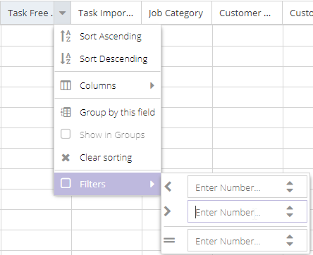
As with most things in Dime.Scheduler, you can configure a lot in the grids: which columns to show, in what order, and which sorting, filtering or grouping to apply. The starting point for all of these is the column menu. Every column in every grid has one. Hover over a column header and click the arrow that appears:

The menu options behave as their labels suggest, but here is a quick overview:
- Sort a column with "Sort Ascending/Sort Descending", or remove sorting with "Clear Sorting". You can also click a column header directly to sort on it.
- Choose which columns to show by clicking "Columns" and marking or unmarking fields in the list.
- Group the data with "Group by this field".
- Toggle grouping by checking or unchecking "Show in Groups".
- Filter a field by selecting "Filters" and typing or selecting the filter value.
The sections below cover these features in more detail.
Column selection
Adding and removing columns
Adding or removing a column is straightforward. Open any column's header menu by clicking the icon, then hover over the "Columns" sub menu to see every column available for that component.
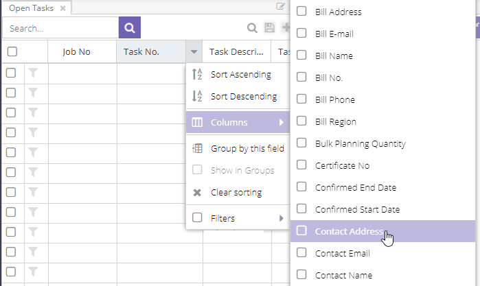
Each grid has its own set of columns relevant to that component. Columns already visible in the grid show a marked checkbox next to them:

To remove a column, uncheck the box next to it. To add one, check the box. Show as many or as few columns as you like.
Note: adding and removing columns involves no server-side interaction. The data is already loaded for all the columns of the rows.
Change the order of columns
Reorder columns by dragging and dropping their headers.

The green arrows show where the column will land. Use this to arrange columns in a sequence that makes sense to you.
Sorting
Sorting applies to the entire data set, not just the page you are currently viewing. Depending on the grid (and whether it is paged), sorting may require the application to query the database to fetch the correct set.
Keep in mind that the column's underlying data type affects the result. It can surprise you that "100" comes before "20" when a text field is used to represent numerical data.
How to apply sorting
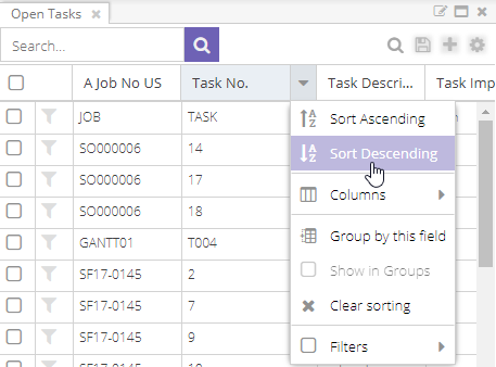
You can sort in two ways: through the column menu or by clicking the column header.
From the column menu, choose to sort the column in ascending or descending order.
Once sorting is applied, the column shows an icon for the sort order:

If no sorting is applied and you click the column header, the column sorts in ascending order. Click again to toggle to the opposite direction. You cannot clear sorting from the column header; use the "Clear sorting" option in the column's header menu instead.
Multiple sorting
A grid can have more than one sorter. The order in which the sorters are defined determines the overall result. For example, when you sort by "Job No" and then by "Task No", the data set is first sorted by "Job No". After that pass finishes, a second pass runs on the sorted list and sorts by "Task No".
An example makes this clear. Here is the list of open tasksOpen taskA task that has not been scheduled yet. It waits in the open task list to be placed on the planning board. as it appears in the database:
| Job No | Task No |
|---|---|
| Job 1 | Task 5 |
| Job 2 | Task 4 |
| Job 1 | Task 3 |
| Job 3 | Task 2 |
| Job 1 | Task 1 |
Sorting jobs in descending order gives this result:
| Job No (DESC) | Task No |
|---|---|
| Job 3 | Task 2 |
| Job 2 | Task 4 |
| Job 1 | Task 5 |
| Job 1 | Task 3 |
| Job 1 | Task 1 |
Adding a second sorter on tasks in ascending order gives this result:
| Job No (DESC) | Task No (ASC) |
|---|---|
| Job 3 | Task 2 |
| Job 2 | Task 4 |
| Job 1 | Task 1 |
| Job 1 | Task 3 |
| Job 1 | Task 5 |
The jobsJobA high-level container, comparable to a project, that bundles related tasks together with common information such as customer, billing, and address. are still in descending order, but the tasksTaskA unit of work that belongs to a job. It appears in the open task list until it is scheduled to a resource. within the same job are now in ascending order. Depending on the type of grid, data may be queried locally. With a local data store, this operation triggers no server-side interaction. With a remote data store (which is the case for all paged grids), the database is queried to fetch the requested page with the right set of parameters: filters, groups and sorters.
Clear sorting
Remove a sorter from a column with a single click in the column's header menu:

This re-evaluates the query and may return a different data set.
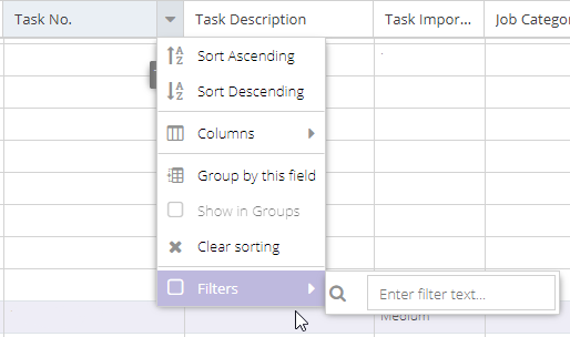
Filtering
The filter type shown depends on the column's data type. As with sorting, you can define multiple filters on a grid. Only records that match all of the filters are returned.
There are four basic data types:
- Text
- Date
- Boolean
- Number
Text field
For a text column, you can enter a text query:
Dime.Scheduler then retrieves every record where the column contains this text. To require an exact match, tick the checkbox below the text field 1. A few symbols have a special function:
| Symbol | Description | Example |
|---|---|---|
<> | The "not" operator that inverses the query | <>SO0006 will retrieve all items that do not contain the text SO0006 |
| | | The "or" operator | SO0006|SO0005 will retrieve all items that contain the text SO0005 or SO0006 |
| & | The "and" operator | SO0006&SO0005 will retrieve all items that contain the text SO0005 and SO0006 |
| * | The starts with or ends with operator |
|
| '' | Two single quotes - without a whitespace - implies an empty values filter. | '' |
As the examples show, these symbols can be combined. A query like <>SO0006&SO|SF&<>SL* is valid. Decoded, it places the following filters on the query:
- Exclude every record that contains SO0006;
- Include all records that contain SO or SF;
- And exclude any record that starts with SL
Date field
Date fields are a little more involved to query, so the filters let you find records with a date earlier or later than the one you enter:
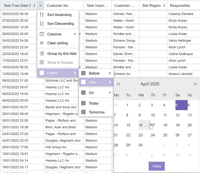
This list also includes two special filter types: Today and Tomorrow. The key thing to know is that these are dynamic while the others are static, since today and tomorrow change every day.
Number field
Like the date filter, number filters let you filter on values smaller and greater than the number you enter:
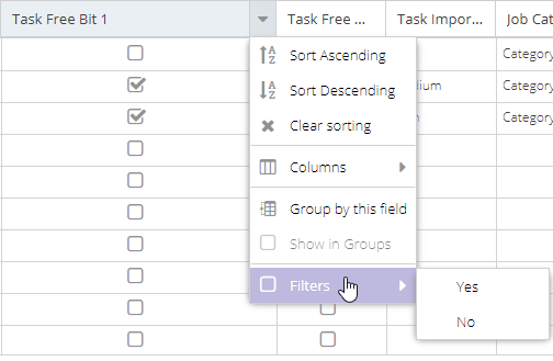
Boolean field
Boolean fields usually appear as checkboxes in the grids. In the filter menu, this true/false type is shown as "Yes" and "No" options:
Grouping
Grouping is the odd one out among these features, because it always runs locally rather than at the database level. Dime.Scheduler only groups the data on the current page. As a result, items in the same group may be spread across multiple pages, depending on the size of the data, sorting and filters. Grouping is also limited to one level; nested grouping is not (yet) supported.
To group a column, open its menu and select the grouping item:

Once grouping is applied, you can expand and collapse groups:
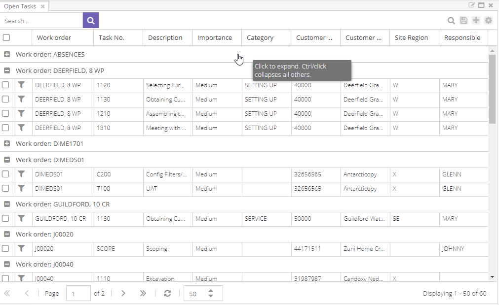
As the tooltip indicates, you can collapse the other groups with CTRL + click.
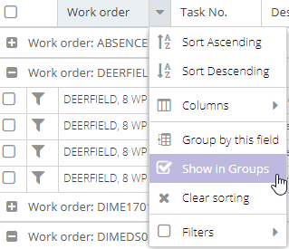
To remove grouping, open the column's menu again and select the corresponding item:
Paging
To handle large amounts of data, Dime.Scheduler pages the grids. Instead of showing everything at once (which would be slow), the grid shows a subset and lets you flip through pages.
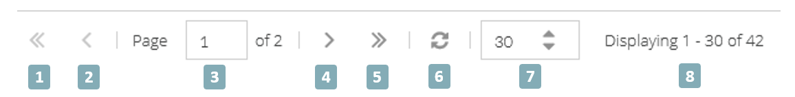
- Navigate to the first page
- Navigate to the previous page
- Current page number: type a page number to flip to that page
- Navigate to the next page
- Navigate to the last page
- Refresh the current page
- Number of records per page: use the arrows or enter a number to change the page size. The grid reloads automatically when this value changes.
- Shows which set of records is displayed out of the total in the grid 2.
Stateful grids
Some grids are stateful, which means you can save templates and share them with coworkers. Every grid has its own implementation (its buttons and flags may be part of the state), but all of them store at least the following:
- Selection and order of the columns
- Column width
- Column filters
- Column sorting
- Page size
A stateful grid is easy to spot. When these icons appear on the toolbar, the grid is stateful. The buttons are covered below in the order they appear.
For more about layouts, read the layouts guide.
Open layout
Each dock panel holds one component. If that component is a grid, you can apply a layoutLayoutA saved arrangement of the planning board - visible resources, columns, and settings - that can be reused. to it. You can open as many layouts as you want during a session. Click the lens icon to open a modal grid listing every layout available for that component:

A layout is available when it meets at least one of these conditions:
- The layout was created by that user
- The layout was shared with all users of the organization
- The layout was shared with a group the user belongs to
Opening a layout does not modify the active user profileProfileA saved snapshot of a user’s planning board configuration, including the chosen layout and view options.. Even if the profile has a default layout for that component, no changes are made to the profile. This lets you try out different presets on the fly without committing to those settings. State is simply a way to store presets so you do not have to reconfigure grids every time you start the application.
Reset layout
Once a layout is loaded and applied, you can keep adjusting the component's layout. This is often used for on-the-fly queries to find a particular record. Such a query may lead to a new layout (see save layout and save as layout). When you want to start over, the reset layout button returns the component to its original state, with its own filters, sorters, groupers and so on.
Save layout
With the right security clearance, you can create and update layouts. The floppy disk icon updates the active layout. A few caveats apply:
- You can only update your own layouts, but you can build your own layouts from other users' layouts.
- When the standard layout is configured and then stored, you are redirected to the "Save as" feature, since there is no record yet in the database.
- You can only save default layouts in profiles you own.
- You cannot save layouts on a standard profile; a profile must exist before layouts can be saved.
It is worth stressing that the active layout is modified, not necessarily the default layout. When you start Dime.Scheduler with a default profile whose components have a default layout, the active layout equals the default layout. But once you open a different layout, that one becomes the active layout, and saving applies your changes to it rather than to the previous (or default) layout.
Save as layout
The "Save as" feature works like it does in word processors such as Microsoft Word. Instead of overwriting the current layout, you create a new one. To save the new layout, Dime.Scheduler needs a name, whether it should become the new default layout, and the sharing options. The modal window prompts for all of these:

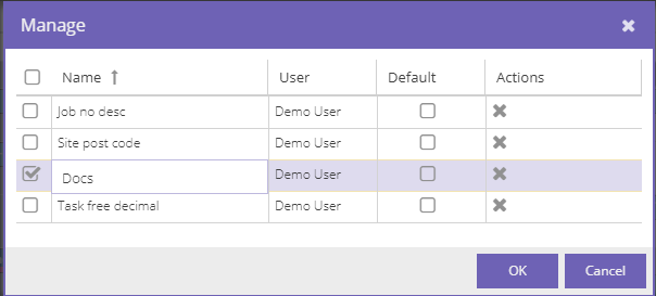
Manage layouts
The last state feature lets you rename a layout, mark it as the default for that component, and delete it.
Every component in the profile can have its own default layout. For example, two open tasks grids in one profile may have different default layouts. This is also why a profile must exist before you can store layouts.
The same caveats as in save layout apply: you can only remove your own layouts and set your own default layouts for the profiles.
Optional feature: Search
Many grids in Dime.Scheduler also have a search bar. It uses the same framework as the column filters but takes a slightly different approach: rather than filtering on one column, it searches all visible columns. This makes the filter much broader in scope than a column filter.
Take the following open task grid:
| Job No | Task No | Customer Name |
|---|---|---|
| Job 1 | Task 1 | Customer 1 |
| Job for Customer 1 | Task 2 | Customer 2 |
| Job 3 | Task 3 | Customer 3 |
When you search for "Customer 1", Dime.Scheduler looks in the "Job No", "Task No" and "Customer Name" columns for a value that contains "Customer 1". In this data, two rows match.
By contrast, applying two column filters on "Job No" and "Customer Name" would return nothing, because no record has "Customer 1" in both the "Job No" and "Customer Name" fields. The search bar handles exactly this kind of question: any match in any of the columns counts.
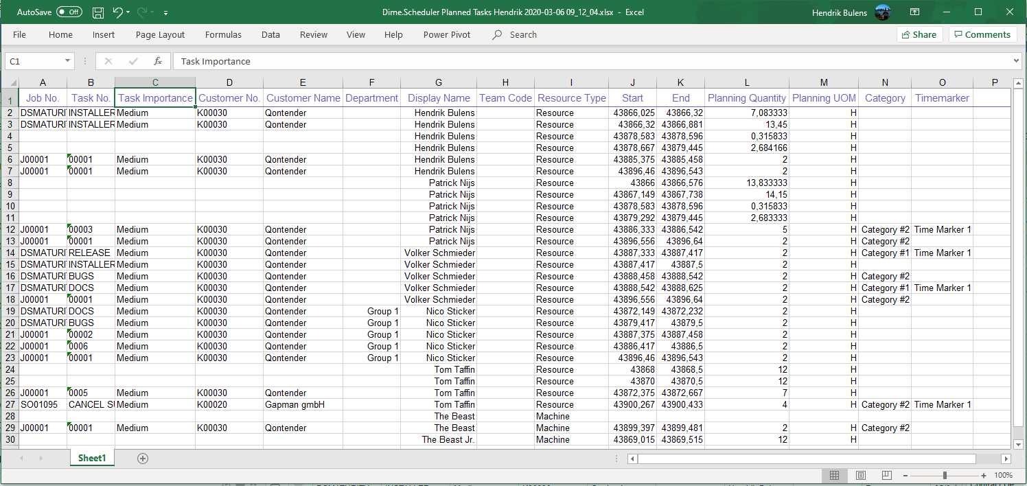
Export
The icon exports data to Excel files. As with the state functionality, the visible columns and their order are exported to the requested file format.
When you click this button, the file downloads right away. The file name format is Dime.Scheduler [Grid type] [User Name] [Date].xlsx.
Here is what to expect inside the file:
Copy data
You can copy data from the grids with standard text selection: select a cell and drag until the text you want is highlighted.
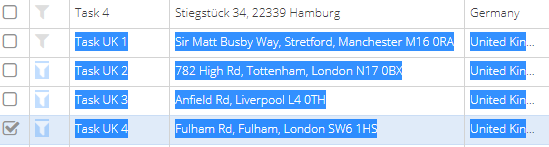
Then press CTRL + C to copy the data to the clipboard. You can copy multiple rows and columns. Depending on where you paste, the software preserves the tabular format.
Some grids also support drag and drop. Because it is hard to tell whether you are dragging a record or selecting text, these grids add a button to toggle the drag behavior. Their default behavior is drag and drop. Click the button to enable text selection mode, which temporarily disables drag and drop. Click the button again to restore the original setting.