Introduction to components
Components are the building blocks you assemble into a workspace. Each one delivers a distinct set of features for planning, and you pick the ones that matter for the job at hand. Most components are also stateful: you can store their settings and share them with other users. A stored configuration of a component is called a layoutLayoutA saved arrangement of the planning board - visible resources, columns, and settings - that can be reused..
Add as many components (and their layouts) to a workspace as you need, and arrange them however you like. A saved workspace is called a profileProfileA saved snapshot of a user’s planning board configuration, including the chosen layout and view options.. Like layouts, profiles can be shared with other users.
The available components are:
- Open Tasks: shows tasksTaskA unit of work that belongs to a job. It appears in the open task list until it is scheduled to a resource. that need to be planned.
- Planned Tasks: shows planned tasks in a grid for easier searching.
- Task Details: shows detailed information about a selected task (open or planned) or appointmentAppointmentA task scheduled to a resource for a specific period - the scheduled instance you see on the planning board..
- Gantt Chart: allows to plan projects using a Gantt chartGantt chartA timeline view for long-term project planning, showing tasks, durations, dependencies and milestones. including dependencies, constraints and multiple planning modes.
- Map: shows the map, location of addresses, position of resourcesResourceAn entity that can carry out work - a person, vehicle, tool, or room - that you schedule on the planning board. and assets, calculated route, travel time and travel distance.
- Resource Filters: allows to filter resources on the planning boards.
- Calendar: you use the calendar to select a custom date range (other than the presets you find on the planning board) for the planning boards.
- Category: shows a legend of the categories, which color means what?
- Notifications: shows notifications about a selected task or appointment.
- Route Sequence: visualize and change the sequence of a selected route on the map.
- Capacity: pivot grid to report on the capacity of the resources.
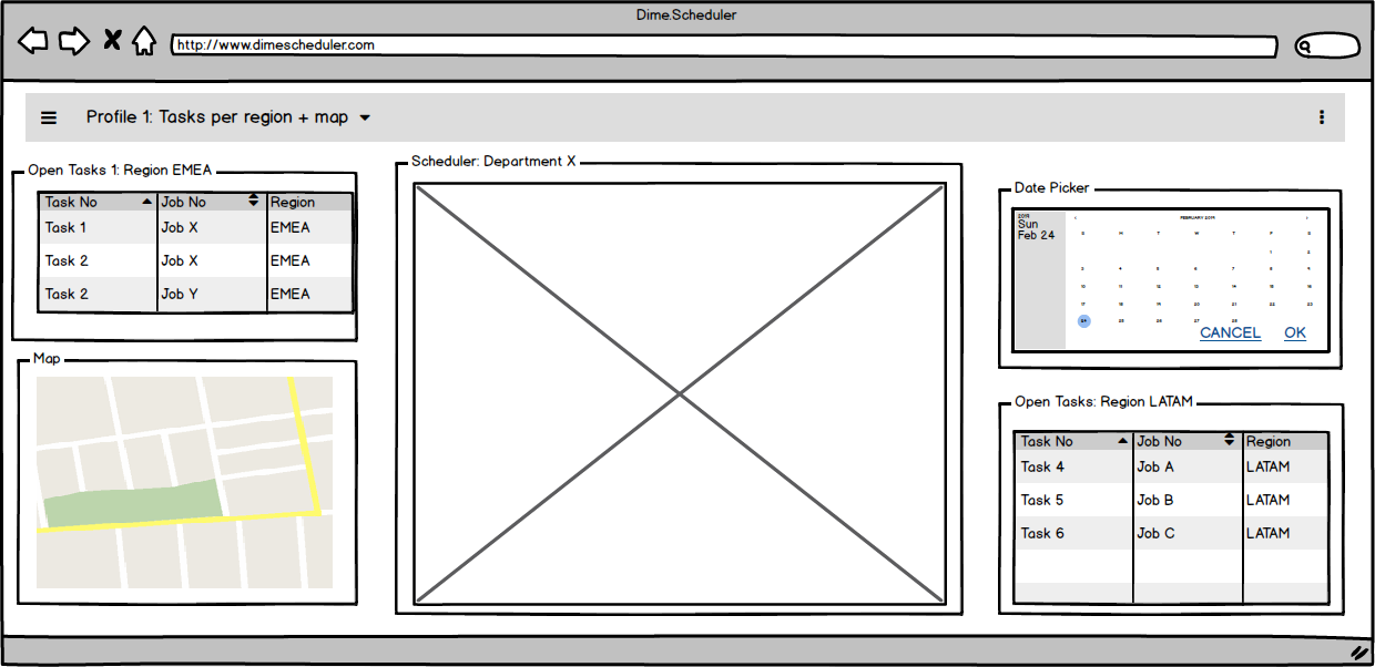
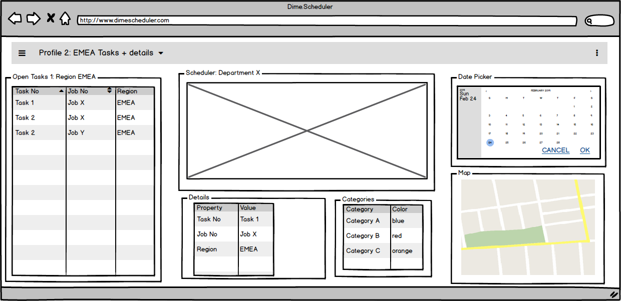
Every component ships with a standard setup. Dime.Scheduler applies it whenever the profile has no default layout for that component. Think of a component as a placeholder for a set of features you can configure and save. The example below shows two Open Tasks grids, each with its own state. They share the same type, so they offer the same information and capabilities, but they differ in the customizable parameters on each component. The next sections cover those configurable elements in detail.
This granularity (profiles, layouts and components) lets you build a workspace that matches your preferences. Layouts are reusable, for instance: you can apply the same layout to a component in another profile, like this:
Many components are connected to support the planning process. A key example is drag and drop: you drag open tasks and drop them on the planning board. Each component's page covers the interactions that originate from it. For now, keep in mind that they exist and that the component type, regardless of the layout applied to it, determines its capabilities.
Quick start
Open Tasks
The open tasks component lists the tasks sent from the back-office application that are ready to be planned
Planning Board
5 items
Date Picker
The date picker lets you select a date range that other components use to filter their data sets
Resource Filters
Match the right resource to a task using the query builder or filter icons in the grids.
Notifications
Surface back-office notifications and contextual information for the selected task or appointment.
Planned Tasks
Query, analyze and bulk-update appointments in a grid view of the entire planning.
Gantt Chart
Plot project task timelines, dependencies and milestones on the Gantt chart component.
Details
Display key-value field information for the selected task, appointment or open task in a grid.
Pivot
Compare actual planning to projected resource capacity in a pivot grid with configurable rows and columns.
Map
Visualize jobs, tasks, appointments and resources on a geographical map integrated with other components.
Route Sequence
List, reorder and refine the sequence of stops on a map-based route via the route sequence grid.
Indicators
Browse categories, time markers and pins in an accordion panel and drag them onto appointments.
Grids
Sort, filter, group and configure the common data grids used across Dime.Scheduler components.