Date Picker
The date picker is the shared date control for the workspace. Several components are scoped to a date range (the planning board, the capacity pivot grid, the planned tasks grid), and without a shared control the planner would have to set the same range on each of them every time the focus shifts to a different week. The picker solves that by being the single source of truth: change it here, and the components that listen update with it.
It's two-way as well as shared. When the planner steps a planning board forward by a week or zooms a pivot grid to a quarter, that change flows back to the picker. The display always matches whatever range is currently in play.

Colors vary with the theme but the scheme is constant: the darkest shade marks the start and end of the selected range, the lightest shade fills the days in between, and a separate accent marks today.
Picking a range
A range always has a start and an end (the same day on both is fine, the result is still a range). Two gestures get there.
The first is freehand. Click the first day, move the mouse (no button held) to the last day, click again to confirm. A tooltip during the move shows the duration of the prospective range, which helps when the planner is aiming for "exactly two weeks" rather than a specific end date.

A range can span multiple calendar months. Click the month-shift arrows during selection and the calendar walks forward without losing the active start day.

For a single day, click the same day twice.
The second gesture is the week column. The number on the leftmost column of each row is not a label; clicking it selects the whole week as a range. The fastest way to ask "what's planned this week?"

The selected range applies to every listening component immediately.
Navigating dates
The date-shift arrows next to the month and year nudge the visible calendar one step at a time. For larger jumps the picker has two quick-jumps: click the month to choose a different month, click the year to choose a different year.
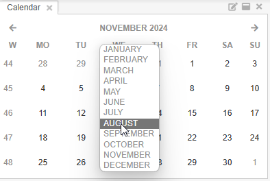
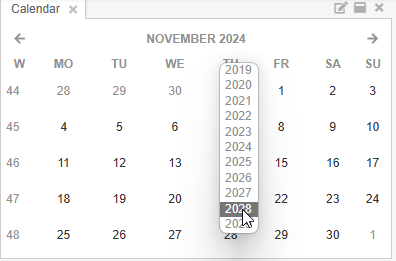
Both keep the current selection intact, so the planner can browse to a future month without losing the range they've already started building.
Two-way binding with the workspace
The picker is not just an input. The connection runs both directions: any component that holds its own notion of a date range pushes that range back when the user changes it. Stepping a planning board to the next week updates the picker; switching the planning board's view from day to week updates the picker; setting a default start date in the profile settings updates the picker. Whichever side initiates the change, the date picker and the listening components stay in sync without the planner having to mediate.