Pivot
The pivot grid is the planner's overview lens for capacityCapacityThe amount of working time a resource has available in a given period, used to spot over- and under-planning.. The planning board shows what's scheduled, appointment by appointment, but it cannot answer "did we balance the week?", "are some resourcesResourceAn entity that can carry out work - a person, vehicle, tool, or room - that you schedule on the planning board. overbooked while others are idle?", "can we still take on more work?" Those questions need totals, comparisons, and aggregation across time and groups, which is exactly what the pivot grid does.
It compares the actual schedule on the planning board against the projected capacity maintained in the back office. Slice that comparison by any combination of resource attributes, time buckets, and aggregators the situation demands, save the result as a reusable layout, and the planner has a load-vs-capacity dashboard customized for their own work.
The component is built from three areas: a configurator on the right where the planner shapes the report, the pivot table itself in the middle, and a top bar with state-management controls.
Shaping the report
Reports come from dragging fields onto axes. The left column of the configurator lists every available field in three groups, kept apart only to help the planner find what they want:
- Resource fields like department, type, team
- Date fields like day, week, month, quarter
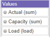
- Value fields like planned quantity, capacity, load, variance
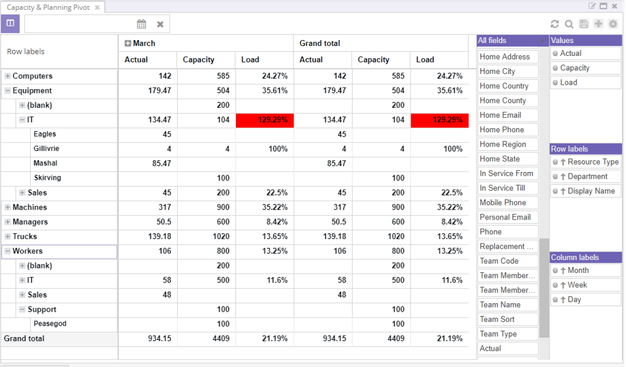
Every field added to an axis becomes a new level. A common report puts a resource grouping (department, then resource type, then resource) on the rows, time buckets (quarter, week, day) on the columns, and load on the values. The result is a multi-level capacity report where the planner can collapse to the top level for the boardroom view and expand to the leaf for the operational view.
Rows, columns, values
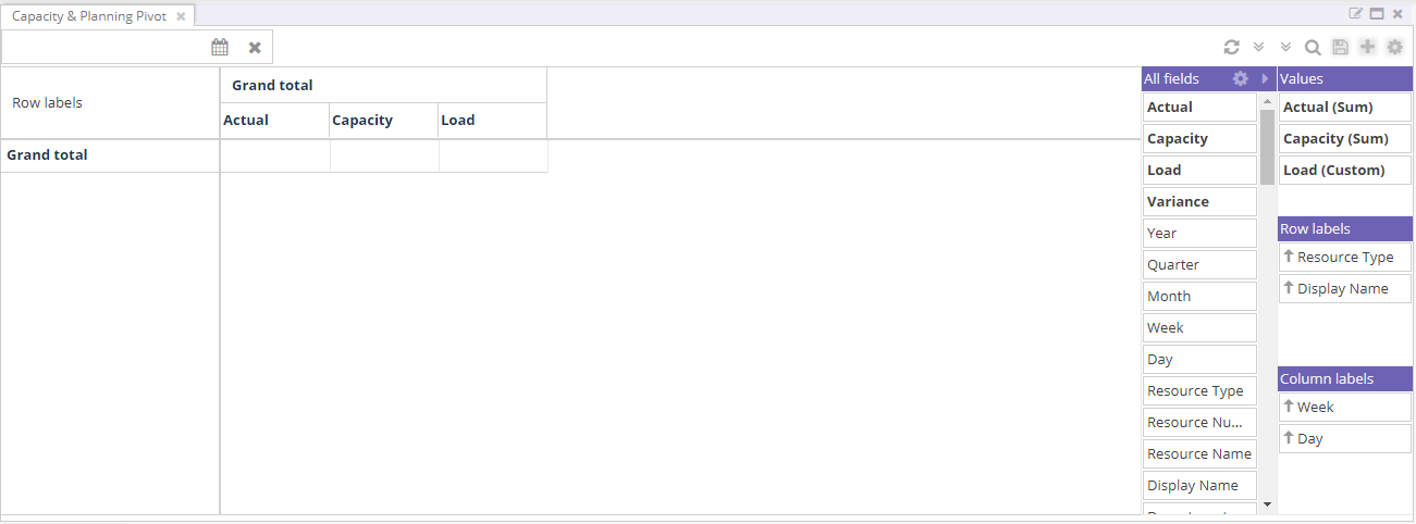
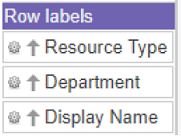
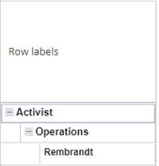
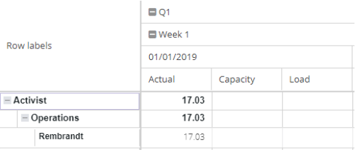
The row labels sit on the vertical axis. The first item in the list is the outermost group, the second nests inside it, and so on. This configuration...
...produces this report:
Column labels work the same way for the horizontal axis...


...and the values column at the intersection holds the aggregates:
Sorting and filtering
The cog wheel on each field opens a context menu that sorts and filters that axis.
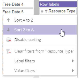
Label filters operate on the axis itself: report on one resource type, or one week, and the pivot drops everything that does not match. Value filters operate on the aggregated numbers instead, and apply at the lowest level of the pivot (capacity per resource per day) before rolling up. That distinction matters: a value filter like "load above 100%" finds individual overbooked resources, not departments whose averaged load exceeds 100%.
Reordering, totals, layout
Reorder labels and values by dragging within the configurator, or via the field's own menu.


The cog wheel in the configurator header opens layout-wide settings:

Subtotals and grand totals can be placed at the top or bottom of their group, separately for rows and columns. Row labels can also use an outline layout (one column per label, sortable per level) or a compact layout (a single tree column that collapses and expands, sortable only on the first level).
Reading the report
The pivot table itself looks and behaves like the other grids, with a few differences. Configuration lives in the configurator, not the column headers, and the table is multi-dimensional, so the [+] and [-] icons walk between levels.
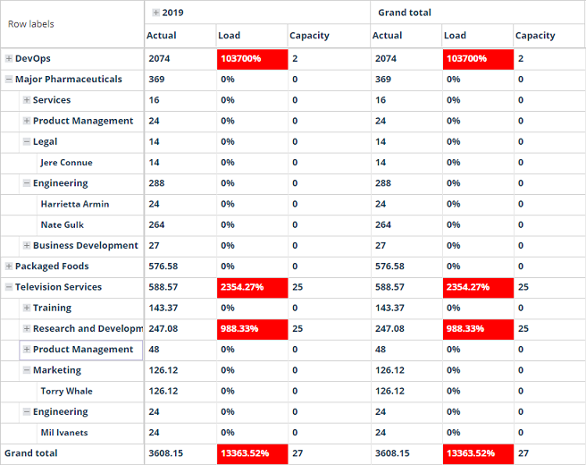
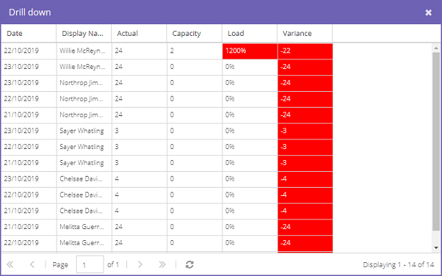
Every group aggregates the data beneath it, so the higher the level, the more averaged the picture. The grid uses color to flag risk: when capacity exceeds 100%, the Load and Variance cells turn red. That cue alone is usually enough to spot the day, week, or resource that needs attention. Double-click a cell to drill down into the underlying records and see exactly which resources are over-allocated:
The top bar adds two pivot-specific buttons that collapse or expand every row and column in one click, and a date picker that scopes the report. The pivot's date picker behaves like the date picker component, but local: when it has a value, it overrides whatever date range the date picker component or planning board would otherwise push to the pivot.
How capacity is measured
Four aggregators give the report its meaning. Two come straight from the data; two are derived.
- Actual reports the total planning quantity of a resource's appointmentsAppointmentA task scheduled to a resource for a specific period - the scheduled instance you see on the planning board. in the cell's time bucket. Planning quantity is normally hours (a one-hour appointment counts as one), but it can be any unit, fed by a conversion factor from seconds in the appointment's duration.
- Load is the projected capacity for the resource in that same bucket. Maintained in the back office and pushed to Dime.Scheduler. For predictable resources (a lorry's payload is ten tonnes), load is straightforward; for less predictable ones (a consultant), it requires more thought. Load must use the same unit as planning quantity, or the comparison is nonsense.
- Capacity divides actual by load, giving a percentage of utilization.
- Variance subtracts actual from load, giving slack in the underlying unit.
Capacity and variance answer the planner's headline question. Below 100% capacity with positive variance means there is room for more; above 100% with negative variance means the resource is overbooked. The red highlighting on those cells turns the answer into a visual scan.
Multi-day distribution
Multi-day appointments raise a wrinkle: how should their capacity be reported across the days they span? Three modes, picked in the application setup, let the answer match the industry:
- None: all the capacity lands on day one of the appointment.
- Constant: the full capacity repeats on every day.
- Even: the planning quantity is divided across the days.
A worked example. A rental customer takes equipment at 9 AM and returns it 56 hours later. The same booking is reported very differently:
| Mode | Day 1 | Day 2 | Day 3 |
|---|---|---|---|
| None | 56 | 0 | 0 |
| Constant | 56 | 56 | 56 |
| Even | 18 | 18 | 18 |
For rental, constant is the only mode that tells the truth, because the equipment is unavailable for every one of those days, not just the first. Even mode would mislead a planner into a duplicate booking on days two or three. The mode is a global setting precisely because the right answer is industry-dependent rather than per-report.
Connections to the workspace
The pivot does not load on its own when you drop it into a profile; hit refresh on the top bar to populate it. From then on, it picks up its date range from any date picker or planning board in the same profile, unless the pivot's own date picker has a value (in which case the local one wins).
The pivot also listens to the resource filters component the same way the planning board does, so the planner can query the capacity of just the resources matching a particular skill, region, or qualification.
Reference
Like the other grids, the pivot is stateful. Save a layout to turn an ad-hoc report into a reusable template; share it with the team to give everyone the same view. The saved template holds the rows and columns, sorting and filtering, aggregates, totals configuration, the row-label layout, and the collapsed/expanded state of the configurator. The only thing that does not persist is in-place sorting done on the table itself (rather than in the configurator); for permanent sorting, configure it in the configurator.