Organizing the workspace with dock panels
Every component sits inside a dock panel. You can stack these panels, resize them, and move them around to build a workspace that matches how you work. Width, height, stacking order, position on the canvas, and the title are all yours to change.
Dock panels are part of the visualization engine that powers Dime.Scheduler's flexible interface. The components inside them can serve radically different functions, but the panels that contain them all behave the same way. The rest of this page shows you how.
Positioning a dock panel
Click and drag a panel's title to undock it from its stack and move it. While you drag, a shaded area shows where the panel will land if you drop it there.
Here is what you see before the drop:
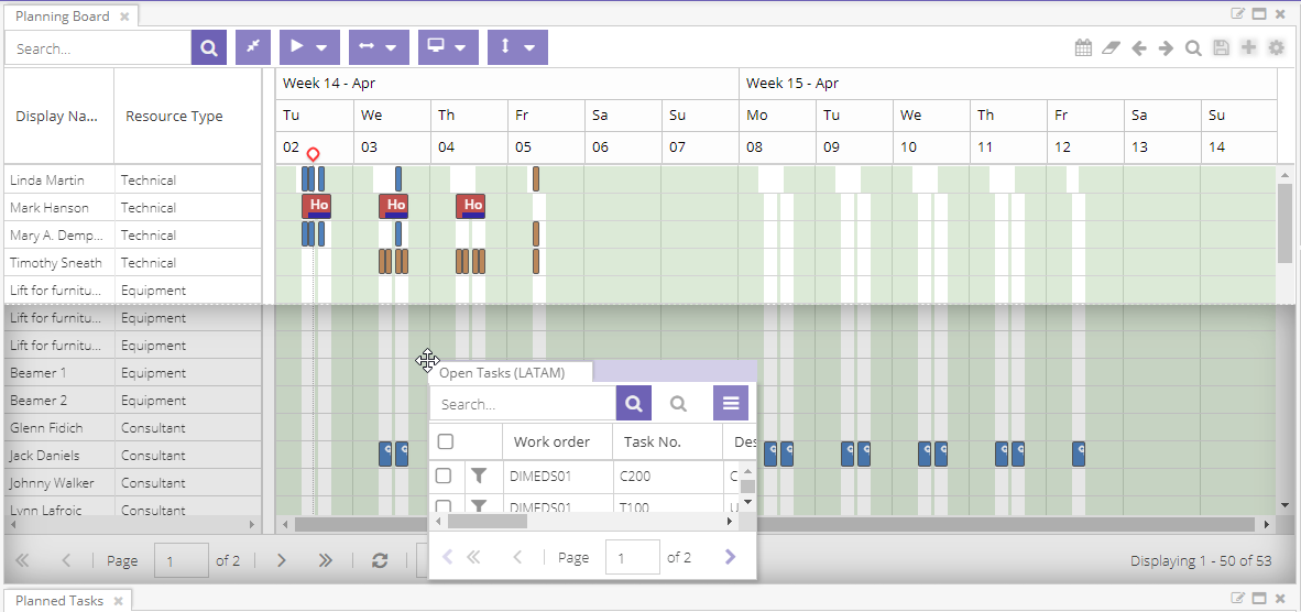
When you drop the panel, it docks again to a stack. Depending on where you drop it, that can be an existing stack or a new one:
- For a new stack, drop the panel at the top, bottom, left, or right of another stack. The space is then split equally between the two stacks. You can change the size afterwards.
- To add the panel as a new tab in a stack, drop it over or next to the other tabs in the panel's title bar.
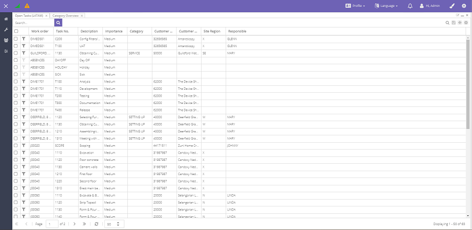
In the example below, the planning boardPlanning boardThe main graphical scheduling surface where dispatchers drag tasks onto resources across a timeline. stack is split in two to make room for the open tasksOpen taskA task that has not been scheduled yet. It waits in the open task list to be placed on the planning board. grid:
Add a component
The same options work for new components. There are two ways to add one:
-
Open the profileProfileA saved snapshot of a user’s planning board configuration, including the chosen layout and view options. menu in the top bar and drag an item onto the canvas.
-
Select a stack first, then click the component you want. The component is wrapped in a dock panel and added to the stack you selected. The currently selected stack stands out with a slightly lighter shade of the theme.

Resizing dock panels
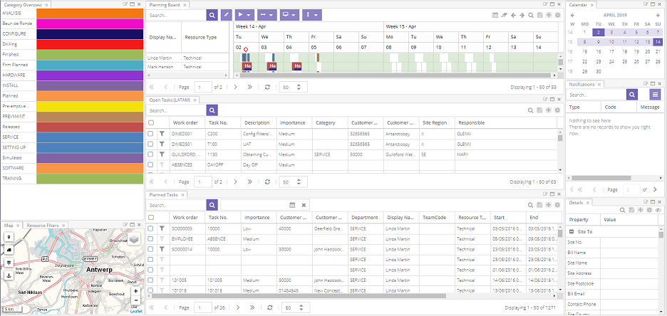
You can also change the dimensions of a dock panel. Hover over the edge of a stack and the cursor changes. Click and hold, then drag to resize the panel in any direction.
Here is how to change the width:

And the height:
Dock panel actions
Every dock panel has three buttons:
- Edit title
- Maximize
- Close
Edit title
The first button lets you change the text displayed in the dock panel.
Before:
After:
As the warning in the modal points out, this is a pending change to the profile. Save the profile to keep it.
Maximize dock panel
Maximizing a dock panel fills the entire canvas with that single component. Minimizing it restores the original view.
Like the previous button, this changes the profile. Save the profile to keep the change.
Close dock panel
Closing a dock panel removes it and its component from your profile. You can always add the component back later, but any changes you made to the removed dock panel and its component are lost.
There are two close buttons: one removes the dock panel (next to the title), and the other removes the entire stack. Closing a stack closes every dock panel inside it.
Like the previous button, this changes the profile. Save the profile to keep the change.