Toolbars
The planning board'sPlanning boardThe main graphical scheduling surface where dispatchers drag tasks onto resources across a timeline. top bar holds the buttons and switches that control what you see and how you work with it. This page walks through each one.
On the left hand side of the bar, you will see something similar to this:

In order of appearance on the image above, these are their functions:
| Capability | Description |
|---|---|
| Search | Filters the resource grid's visible columns by the keyword entered in the search box 1 |
| Fit to screen | Shows the planning of the selected date range in one view 2 |
| Start Date | Sets the start day |
| Range | Sets the range of the visible scheduling view |
| Views | Selects the planning view |
| Appointment height | Sets the height of appointments in the planning board |
| Date range picker | Change the timeline's date range |
On the right hand side of the toolbar, you will see something similar to this:
In order of appearance on the image above, these are their functions:
| Capability | Description |
|---|---|
| Collapse and expand resource rows | Shrinks the appointments to fit on one row or stack overlapping appointments. |
| Toggle containers visibility | Hides or shows the rendering of the containers in the planning board. |
| Ignore or apply calendar mode | Planning board level configuration to apply or ignore resource calendars |
| Clear resource filters | Clear all resource filters |
| Shift | Go to the previous or next time range |
| State | Manage the state of the component's state |
| Export | Export to PDF |
Search
The search bar works just like the other search bars in Dime.Scheduler. The text you enter creates a filter across all visible columns in the resource grid. A resourceResourceAn entity that can carry out work - a person, vehicle, tool, or room - that you schedule on the planning board. is included in the result set as soon as one of its columns matches the query.
For example, searching for 'Ma' in the following resource grid returns two items:
| Resource Display Name | Resource Type |
|---|---|
| John Doe | Consultant |
| Joanna Hope | Machine |
| Max Power | Consultant |
Even though Joanna Hope's display name contains no 'Ma', the resource typeResource typeA logical grouping of resources, such as "excavator" or "consultant", used to organize and filter them on the planning board. does ('Machine'). The third resource matches the other way around: there's no match in the resource type, but there is one in the display name. Had there been only one visible column, the resource grid would have shown only the third resource, since there's no 'Ma' in Joanna Hope's display name.
| Resource Display Name |
|---|
| John Doe |
| Joanna Hope |
| Max Power |
Fit to screen
This toggle button squeezes the scheduling grid into a single view, so you can see the entire planning of the selected date range without horizontal scrolling.
Start date
This menu sets the start date of the date range you view on the planning board. Pick one of the presets:
- Today
- Start of week
- Start of month
Beyond these presets, you can always choose a custom start date and date range with the date picker component.
Note: when you open or create a planning board - by launching the application, opening a profile, or opening a planning board via Add new planning board - the default values come from the 'standard view settings' stored in the user profile.
Range
The range menu sets the visible scheduling range on the planning board through a few presets:
- Day
- Week
- Month
Selecting one of these updates the date picker range to match. For example, selecting the month range adds a month to the planning board's start date, which may cause the component to load the appointments for the added dates.
The range and view menus work independently, but they pair well: a day range works with the day view, just as a (working) week view works with the month range.
Note: when you open or create a planning board - by launching the application, opening a profile, or opening a planning board via Add new planning board - the default values come from the 'standard view settings' stored in the user profile.
Views
The views menu sets the timeline's lowest level of time, in other words, the planning board's time unit. The following options are available:
- Day
- Week
- Work week
- Month
Day view
The day view shows the timeline on an hourly basis. By default it renders every hour of the day; the user profile lets you restrict the start and end time.

The top level in the timeline header helps you keep track of the date.
Week view
The week view goes one level higher than the day view. It shows the days (and the day number), grouped by week.

This is a useful view for high-level planning and capacity reporting.
Work week view
The work week view is essentially the same as the week view, but as the name suggests, the weekends are not included.

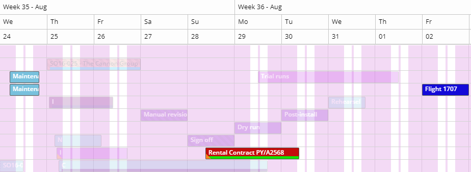
Month view
The month view is useful for planning that spans several months. The days are still the lowest level in the timeline, but it groups by month rather than week:

Appointment height
You can set the height of the appointmentsAppointmentA task scheduled to a resource for a specific period - the scheduled instance you see on the planning board. on the planning board, from one line up to five lines. Click this button in the planning board's top toolbar:
When '1 row' is selected, the appointments will look like this:

In contrast, five lines adds a significant height to the appointments:
Date range picker
This toolbar option is the same as the date picker component, made accessible inside the planning board.
Ignore or apply resource calendars
This toggle button overrides the global resource calendar planning mode, letting you manage the calendar mode at the planning board level. It's an extensive feature with its own dedicated article. Read more in appointment recalculation.
Clear resource filters
Resource filters can be set in several places. There's the component that filters the resources in the planning board, filter action columns in the open and planned tasks grids and the Gantt chartGantt chartA timeline view for long-term project planning, showing tasks, durations, dependencies and milestones., and the option in the planned tasks component to show the resources you selected in the grid. That adds up to two types of resource filter, reached from different components. Here's what each does.
The first is the "Resource Filters" component. It provides a powerful query builder to filter the set of resources on the planning board, so the planner can look for a resource with the skill set or qualifications needed to carry out a task. This is the resource-first approach. The task-first approach works the other way: planners set requirements on the task. For example, only a handful of pilots in the world can land a jumbo jet on St-Maarten's Princess Juliana airport, and a task filter helps you find a pilot in the workforce who is qualified and available. This is what the filter icons at the start of each row in many grids are for. Under the surface, these filters have exactly the same effect as the resource filter component; the difference is that task filters are preconfigured rather than composed on the fly.
The second type is simpler. The planned tasks grid lists appointments and their assigned resources, and the planner can use it to filter out the other resources. This gives a closer look at the planning of those resources without searching for them in the planning board. In short, it's a shortcut to show the resources selected in the planned tasks grid.
When you can't find the resource you're looking for, this button clears all external filters, that is, the filters that aren't part of the planning board's own component. Column filters stay applied. Check the button's tooltip: it shows exactly which filters are currently active on the planning board.
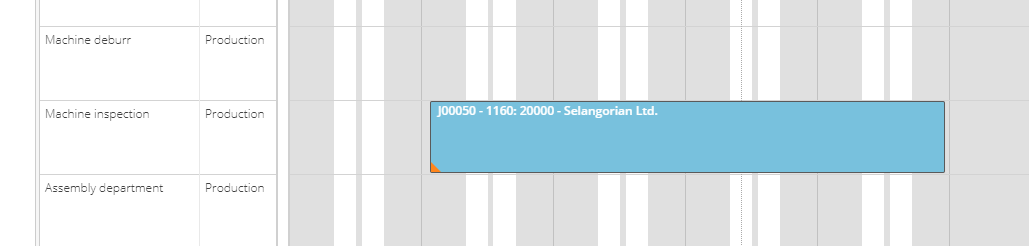
Highlight appointments
From the planned tasks grid, you can select a range of appointments and highlight them on the planning board. If you haven't already, read persistent highlighting first.
Beyond the link between the planned tasks grid and the planning board, you get a few extra capabilities. Two contextual items appear when appointments are highlighted in the planning board:  .
.
The first item toggles the visibility level of the highlighted appointments. It also toggles the editability of the other appointments: to prevent unwanted changes, appointments that aren't highlighted can't be dragged or resized in the planning board. When the highlight feature is activated from the planned tasks grid, the drag-select feature only considers the records selected in that grid, ignoring the rest. In the example below, only two items are selected.
The stop button resets the feature entirely: no appointments stay highlighted and all appointments return to their original state. To activate the feature again, go back to the planned tasks grid.
The visibility toggle button in the scheduler controls the scope of the drag-select feature: when it's on, only the highlighted appointments are considered; when it's off, all appointments on the planning board fall within the dragged area.
Shift dates
Two sets of arrow icons shift the planning board's time range by the applied unit.
This function is connected to the date picker (and the components connected to it, such as the pivot grid or the Gantt chart). Shifting the planning board back and forth updates the date picker, which in turn updates the other components. This keeps all components pointing to the same dates.
Shift 1 day
The and icons shift the timeline one day forward or back.
Shift range
The and icons shift the timeline by the current date range.
The unit varies with the selected date range, which you set through either the date picker component or the range option. The range determines the unit for shifting to the next period. For example, if the date picker shows a five day range, the shift arrows move the visible scheduling range five days earlier or later.
You can also trigger this with the shortcut keys SHIFT + and while working on the planning board. The shortcuts don't work while you're in the open tasks grid.
Planning board state
Like the other components, the planning board is stateful: you can modify and load planning boards on the fly. For more, see the grids documentation.
The planning board has a few more features than the grids, so its state holds more elements. See the stateful grids section for details.
Export
Click the PDF export button and Dime.Scheduler takes a snapshot of the planning board and exports it as a PDF file. A few parameters let you tweak the output 3:
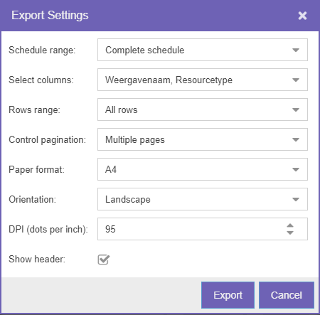
The first field selects the schedule range: the complete schedule, a date range, or the visible schedule. You can also set a row range, either 'everything' or just the 'visible range', and add or remove resource fields. The remaining options are print settings: page format, orientation, pagination control, and whether to add a header to the page.
The export runs on an export server. Once the document is ready, a modal window prompts you to save the file. The output closely matches the planning board:
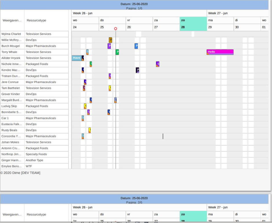
Because the export feature and the planning board are so tightly integrated, we recommend creating a dedicated planning board layoutLayoutA saved arrangement of the planning board - visible resources, columns, and settings - that can be reused. optimized for printing.
Paging
The bottom bar works like the one in every other grid in the application. It pages the resources, which lets the application scale to many thousands of resources.
The paging toolbar contains the following elements:
- Go to the first and last page
- Go the previous and next page
- Select a page by number
- Refresh the page
- Select the page size
Keep in mind that the resources are paged, not the appointments.