Indicators
A planner stares at a dense planning boardPlanning boardThe main graphical scheduling surface where dispatchers drag tasks onto resources across a timeline. for hours. Anything that helps them spot a pattern without reading a single word of text saves real time. IndicatorsIndicatorCollective term for the visual signals - categories, time markers, pins, and tags - that identify and label appointments. are how Dime.Scheduler makes that possible: small visual signals attached to the planning data, each answering a different question about the work.
This page is where you define them. The back-officeBack officeThe ERP or business system Dime.Scheduler plans for - most often Microsoft Dynamics 365 Business Central. It owns the master data and remains authoritative over what it receives. application is usually the master for the indicators themselves - it sends them across along with the planning data. What it typically does not send is what each one should look like, because that is a visualization choice rather than a master-data choice. So in practice you create indicators here only when the back office isn't doing it, and you spend most of your time deciding what things look like.
The four kinds of indicator
Each kind has its own tab at the top of the page, and each answers a different question. The number next to a tab name tells you how many of that kind already exist.
Categories
A categoryCategoryA visual indicator (a color) applied to appointments to classify or label them. answers what kind of work is this. It is the primary classification of an appointmentAppointmentA task scheduled to a resource for a specific period - the scheduled instance you see on the planning board.: order type, work type, status, truck load - whatever the single most useful split is for your planners. An appointment has exactly one category.
Categories are the only kind with an extra field, Outlook Preset, which maps the category onto one of the fixed Outlook category colors. That mapping only matters when appointments are synchronized to Exchange, so the color a planner sees in Outlook lines up with the one on the board. The field carries a reminder, Requires Exchange categories permission., with a Learn more link to the Exchange categories page, because the mapping does nothing until that side of the integration is set up. Categories are also the unit used for user assignments, which lets you steer who is allowed to plan which type of work.
Time markers
A time markerTime markerA visual indicator on an appointment, separate from its category, used to flag a status or condition at a point in time. answers what is happening during this appointment. It is a second, independent signal on the same appointment: a lunch break, standby, travel, a customer meeting inside a longer job. Like the category, an appointment has exactly one.
The distinction between a category and a time marker is worth getting right up front, because both are single-valued and both are colors. Use the category for the classification you sort and report on, and the time marker for the state that changes during the day.
Pins
A pinPinAn indicator that lives on a task rather than an appointment and colors its marker on the map, typically by skill, vehicle type or region. It has no equivalent on the planning board. answers what kind of thing is this on the map. Pins color the markers in the map component, typically by skill, vehicle type, or region, so a planner scanning a geography sees the right technician without opening anything.
Pins live on tasksTaskA unit of work that belongs to a job. It appears in the open task list until it is scheduled to a resource. rather than on appointments, and they are the only kind that has no equivalent on the planning board.
Tags
Tags are currently in preview. Functionality and behavior may change between releases. Not recommended for production-critical workflows yet.
A tagTagA reusable label with an icon and a color that can be applied to tasks and appointments. Unlike a category, a record can carry several tags at once. answers what else do I need to know. It is the one kind that is not single-valued: a task or an appointment can carry any number of tags at once. That makes tags the place for everything that does not fit in the single category slot - urgent, night shift, call the customer first, waiting on parts - without inventing combined category values like "Urgent - installation".
Tags also differ in that they are referenced by a stable code rather than copied onto the record, and they render as icons rather than as a color fill. See Tags for what planners do with them.
How each one is rendered
Defining an indicator is half the job. The other half is knowing where it will actually show up, because that is what decides whether a given color choice reads well or gets lost.
| Indicator | Where it appears |
|---|---|
| Category | The fill color of the appointment bar on the planning board. It is the largest area of color on the board, so it dominates the visual read. |
| Time marker | A colored horizontal bar drawn on the appointment. A thin accent rather than a fill. |
| Pin | The color of the resource marker in the map. |
| Tag | A row of small icons at the top of the appointment bar, each in the tag's own color, plus colored chips in the Tags column of the task and route grids. |
There are more visual signals on an appointment than the four you manage here - importanceImportanceA fixed scale driven by the back office, shown as an exclamation mark or arrow at the start of the appointment bar. What it stands for (priority, urgency) is decided when the application is set up. and notificationsNotificationA message from the back office attached to a task, an appointment or the whole tenant. The notifications component lists them, and a colored vertical bar on the appointment signals their severity. are driven by the back office rather than by a catalog. For the whole picture, and for advice on choosing a palette that survives a dense board, see Appointment visualization.
Managing the catalog
Every tab works the same way. The grid itself is read-only: you never type into a cell. Click Add to create a new indicator, or the pencil icon on a row (or double-click the row) to edit an existing one. Both open the same dialog, which holds every field the indicator has. Name is always required, and nothing is saved until you click Save.
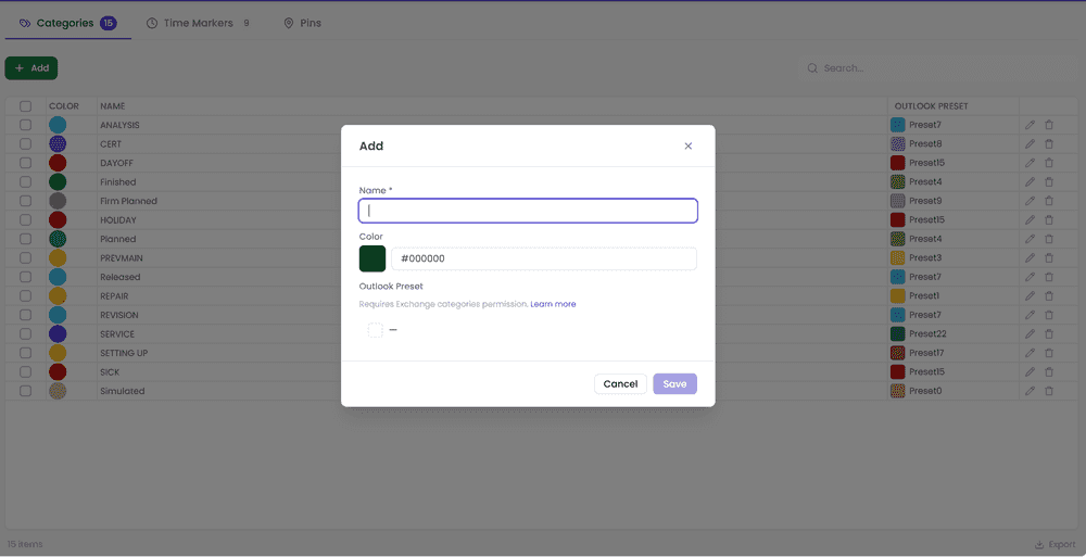
The search box filters the rows on every column at once, which starts to matter once a catalog grows past a screenful; the footer tells you how many rows match out of the total. The Export link in the footer downloads the current tab as a CSV file, handy when someone wants to review the palette outside the application.
To remove indicators, use the trash icon on a single row, or tick the checkboxes and click the Delete button that appears in the toolbar; the DELETE key does the same for the ticked rows. Either way a dialog asks you to confirm before anything is removed. If the server refuses the delete, for example because the indicator is still in use by jobsJobA high-level container, comparable to a project, that bundles related tasks together with common information such as customer, billing, and address., tasks, or appointments, the dialog stays open and shows the reason. Clear the references first (or wait for the back office to clear them), then come back and delete.
Tags are the exception. Deleting a tag does not touch the records that reference its code. Those references stay in the data and simply stop rendering, so recreating the tag under the same code brings them back.
Setting the color
The color is part of the Add and Edit dialog. Click the swatch next to Color to open the browser's color picker, or type a hex value straight into the box next to it when the design team has handed you a palette.
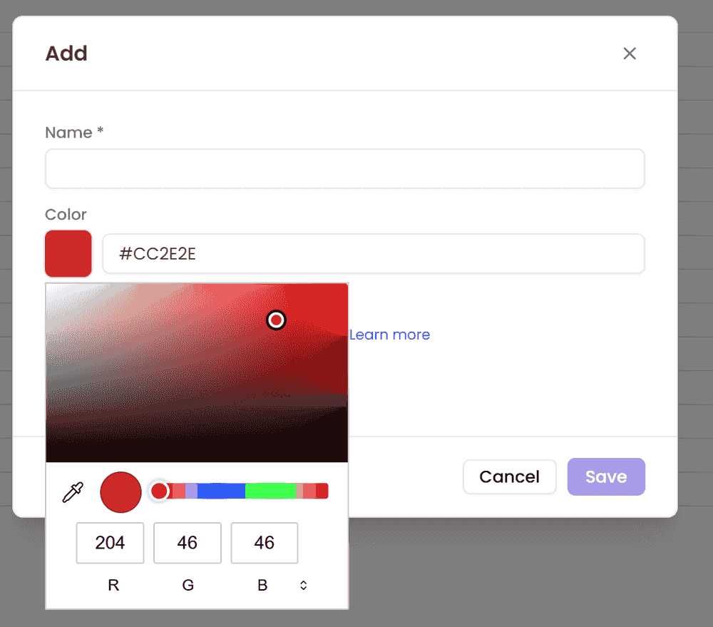
A new indicator starts out royal blue, and an indicator that arrived from the back office without a color is drawn black, so an imported catalog that nobody has styled looks uniformly dark until someone goes through it.
Which colors to actually pick is a design decision rather than a mechanical one, and it is worth a few minutes before you start clicking: see choosing colors that survive a real board.
The extra fields on tags
Tags carry three fields the other tabs do not, all of which follow from being referenced by code:

| Field | Description |
|---|---|
| Code | The stable identifier that tasks and appointments store. Required, and locked once the tag is created - a rename must not orphan the records that reference it. Rename the name instead. |
| Icon | The icon rendered on the appointment bar, shown in the tag's color. The picker opens with a curated Suggestions set above the full catalog, and a search box that looks through names and aliases. Choose None to clear the icon again. |
| Hidden | A checkbox in the dialog. A hidden tag is left out of the planner's pickers and the indicators panel but keeps rendering on records that already carry it; it just cannot be applied by hand any more. Use it to retire a tag, or for tags only the back office is allowed to set. |
Codes travel over the API, so choose them the way you would choose an ERP code: short, uppercase, and stable. NIGHTSHIFT ages better than Night shift (new).
Reference
Shortcut keys
| Shortcut key | Action | Remark |
|---|---|---|
| DELETE | Deletes the ticked rows. Is the equivalent of the Delete toolbar button. | Only when at least one row is ticked |