The portfolio
The projects page lists everything in flight. Its job is not to show you one projectProjectA job seen as a whole in project planning: a body of work with a budget, a team, dependencies and a deadline. Its tasks are still planned as ordinary appointments on the board. in detail, it is to tell you which project to open next.
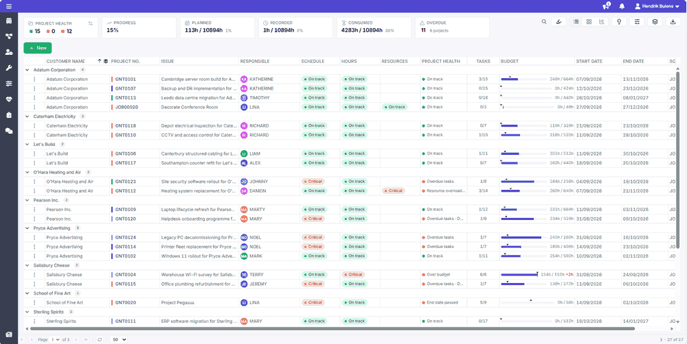 The portfolio as a list
Three ways to look at the same thing
"How is the portfolio doing" is a question people want answered in different shapes, so the same data is available three ways from the toolbar.
| View | Best for |
|---|---|
| List | Knowing what you are looking for. Sort, filter and group like any other grid. |
| Tiles | Scanning. One card per project, each carrying its health measures. |
| Timeline | Sequence. Projects laid out against time, so overlaps and imminent starts are obvious. |
The tiles can be grouped by customer, category or responsible person, and sorted by end date, importance or job number. Each card carries the same measures as the list, and the header of each group adds up the health of the projects inside it.
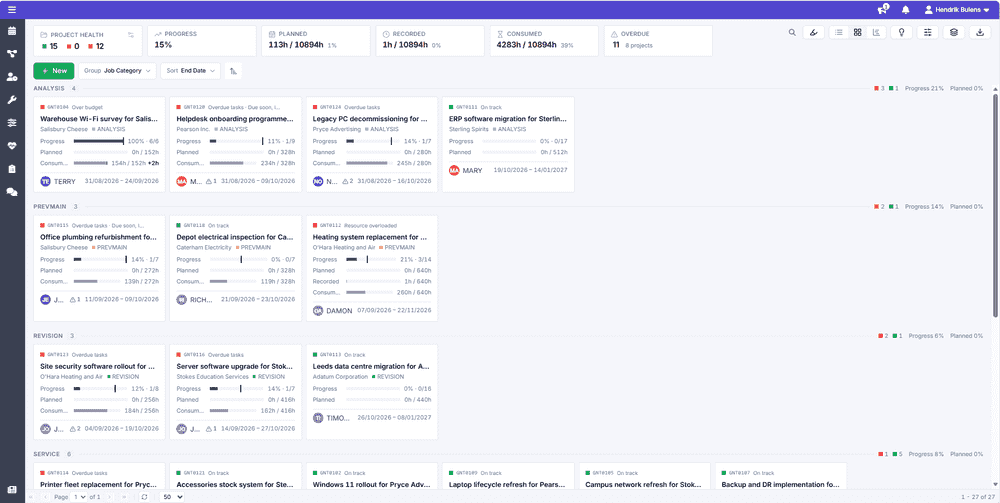 The portfolio as tiles
The timeline colors each bar by one measure at a time. Project healthProject healthThe rollup of three measures per project - schedule, hours and resources - each reading On track, At risk or Critical. The thresholds behind the colors are set on the portfolio and can be tightened per project. is the default, and the same dropdown switches to schedule, hours, resources or category, which is how you ask a narrower question such as "which projects are over on hours" without leaving the view. With the capacity strip open, a sixth option matches the bars to the capacity colors underneath.
The portfolio as tiles
The timeline colors each bar by one measure at a time. Project healthProject healthThe rollup of three measures per project - schedule, hours and resources - each reading On track, At risk or Critical. The thresholds behind the colors are set on the portfolio and can be tightened per project. is the default, and the same dropdown switches to schedule, hours, resources or category, which is how you ask a narrower question such as "which projects are over on hours" without leaving the view. With the capacity strip open, a sixth option matches the bars to the capacity colors underneath.
 The portfolio as a timeline
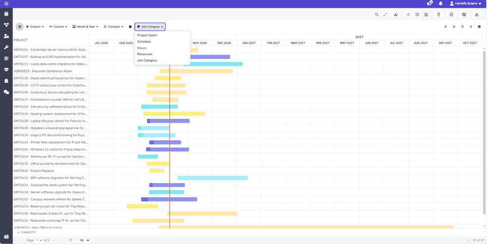 Choosing what the timeline colors by
A Capacity strip opens under the timeline. It plots demand against capacityCapacityThe amount of working time a resource has available in a given period, used to spot over- and under-planning. for the resources the listed projects need, with a utilization bar per resource, grouped by teamTeamA second grouping axis for resources, independent of department, used to sort and group them. In the crews view, "crew / team" is the behavior where a booking fans out to every member., departmentDepartmentA grouping of resources used to sort and group rows on the planning board and in the grids. As a group behavior in the crews view, a department cannot be booked; it exists for structure and reporting. or resource typeResource typeA logical grouping of resources, such as "excavator" or "consultant", used to organize and filter them on the planning board. if you like, so a project that looks fine on its own dates turns out to depend on someone who is already well over capacity that week. Clicking a cell opens that person's week in the Details rail: planned, still to plan and overdue hours per project, with their other projects and non-project work underneath, which is what tells you whether this project is the cause of the overload or merely a victim of it. An Unassigned row collects task budget that nobody has been assigned to yet, which is capacity the plan is counting on without knowing from whom.
Choosing what the timeline colors by
A Capacity strip opens under the timeline. It plots demand against capacityCapacityThe amount of working time a resource has available in a given period, used to spot over- and under-planning. for the resources the listed projects need, with a utilization bar per resource, grouped by teamTeamA second grouping axis for resources, independent of department, used to sort and group them. In the crews view, "crew / team" is the behavior where a booking fans out to every member., departmentDepartmentA grouping of resources used to sort and group rows on the planning board and in the grids. As a group behavior in the crews view, a department cannot be booked; it exists for structure and reporting. or resource typeResource typeA logical grouping of resources, such as "excavator" or "consultant", used to organize and filter them on the planning board. if you like, so a project that looks fine on its own dates turns out to depend on someone who is already well over capacity that week. Clicking a cell opens that person's week in the Details rail: planned, still to plan and overdue hours per project, with their other projects and non-project work underneath, which is what tells you whether this project is the cause of the overload or merely a victim of it. An Unassigned row collects task budget that nobody has been assigned to yet, which is capacity the plan is counting on without knowing from whom.
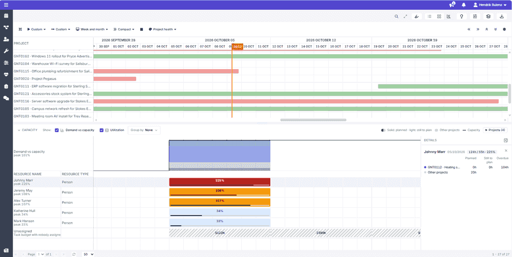 Capacity under the timeline
The insights panel
Three more lenses open in a panel beside the list.
A map plots every project with a site location, colored by health or by category. The slider underneath moves a day cursor through the month: projects not active on that day fade, so you see what is live on a given date rather than everything at once. Travel is a real constraint on who can take what, and the map is where that becomes obvious.
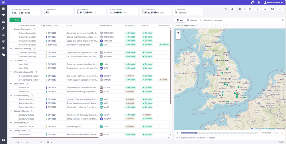 Projects on the map
A heatmap counts the projects, or only the overdue ones, per month for each customer, responsible person, category or type, as a table or a chart. It is how you notice that March is already full before promising anything else for March.
Projects on the map
A heatmap counts the projects, or only the overdue ones, per month for each customer, responsible person, category or type, as a table or a chart. It is how you notice that March is already full before promising anything else for March.
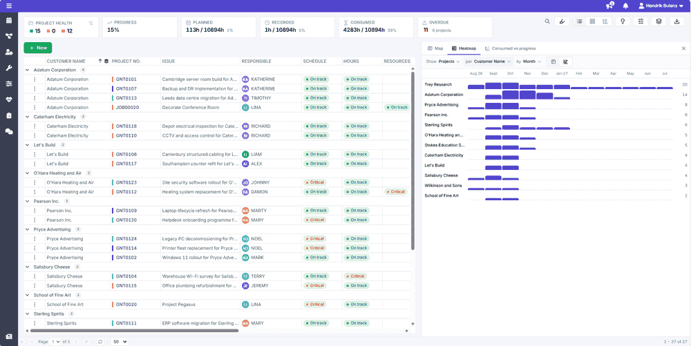 Projects per customer per month
The third lens is a scatter of budget against progress. Each project sits at how far through it reports itself to be on one axis and how much of its budget the chosen layer accounts for on the other, with the dot sized by the budget itself. The diagonal is where the two keep pace. A project above the line is using budget faster than it is making progress, and the further above, the earlier it is worth asking why. The Layer dropdown chooses which hours count: planned, which is what the appointments commit; recorded, which is what was tracked against the project; or consumed, which is what the budget ledger records as used. The footer counts the projects with no budget, the ones with a budget but nothing recorded yet, and the ones that have used more than their budget covers.
Projects per customer per month
The third lens is a scatter of budget against progress. Each project sits at how far through it reports itself to be on one axis and how much of its budget the chosen layer accounts for on the other, with the dot sized by the budget itself. The diagonal is where the two keep pace. A project above the line is using budget faster than it is making progress, and the further above, the earlier it is worth asking why. The Layer dropdown chooses which hours count: planned, which is what the appointments commit; recorded, which is what was tracked against the project; or consumed, which is what the budget ledger records as used. The footer counts the projects with no budget, the ones with a budget but nothing recorded yet, and the ones that have used more than their budget covers.
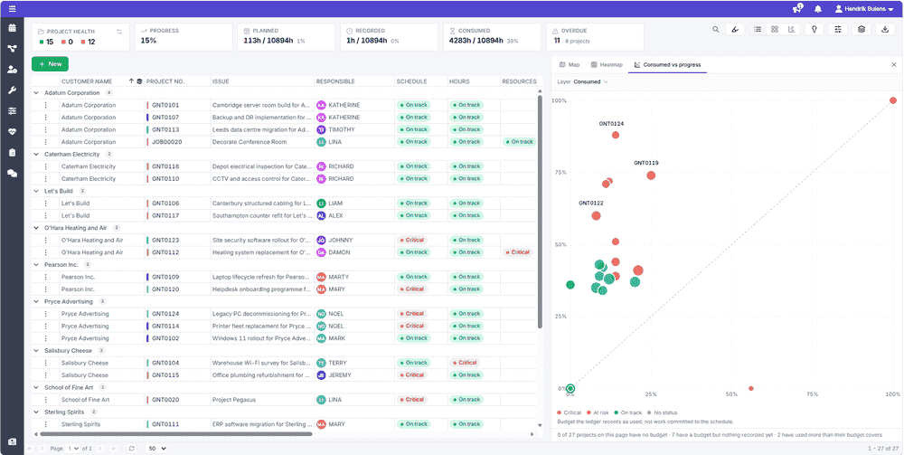 Consumed against progress
Health
A project's health is not one number, and the portfolio does not pretend otherwise. The tiles across the top add the portfolio up: how many projects are green, amber and red, the overall progress, the planned, recorded and consumed hours against the total budget, and the overdue tasks. Per project, the list shows three measures that only mean something together:
- Schedule - whether the project is on time: overdue tasks, an end date that has passed, or an end date that is close with too little progress behind it.
- Hours - how much of the budget has been consumed against what was allocated, and whether the appointments already planned exceed it.
- Resources - whether anybody the project needs is over capacity in one of its weeks.
Each reads On track, At risk or Critical, or No status when there is nothing to judge. The Overall column rolls the three up and, when a rule has fired, prints the cause instead of the color's name: overdue tasks, end date passed, due soon with low progress, over budget, budget nearly used, planned beyond budget, resource overloaded. A project at 30% progress and 80% of budget is the one to worry about, and neither figure says that alone. The portfolio exists to make that combination visible at a glance rather than leaving you to assemble it.
Finding the ones that matter
The brush icon in the toolbar highlights projects by condition: critical, at risk, behind schedule, over budget, overdue or ending soon. Projects matching every condition you pick stay bright and the rest fade, and the counter beside the icon says how many made the cut. It is a quicker way of asking "what needs me today" than sorting on three columns in turn.
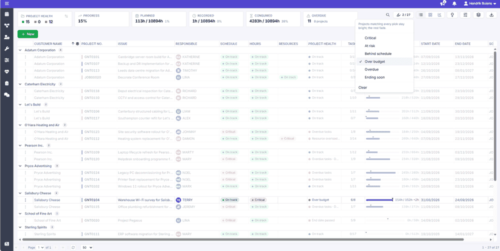 Highlighting the projects that are over budget
What turns a project amber or red
Nothing here is a fixed rule that Dime.Scheduler decided for you. The thresholds behind the colors are set from the settings dialog on this page: how many overdue tasksTaskA unit of work that belongs to a job. It appears in the open task list until it is scheduled to a resource. make a project red, how close to its end date a project may get with how little progress before it turns amber, and at what share of its budget the hours go amber. They are saved with the portfolio layoutLayoutA saved arrangement of the planning board - visible resources, columns, and settings - that can be reused., so they apply to every project on the page, and a project can tighten its own thresholds from its settings.
That is deliberate, because what counts as behind depends entirely on how your projects normally run: a two-week installation and a two-year program do not deserve the same alarm. Which signal counts as progress in the first place is yours to decide too. Both are covered in progress and attention.