Planning board tooltip
When a planner hovers over an appointment on the board, they get a tooltip - a quick read of what this booking is about, without having to open the details panel. This page is where you decide what goes inside that tooltip. The right fields make the planner faster; the wrong fields turn the tooltip into noise.
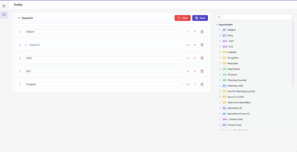
The tooltip builder lives as a second tab on the field templates page. It uses the same drag-and-drop interface as field templates, but with a richer source: instead of the flat list of database fields, it walks the full appointment object graph (appointment → task → job → category → time marker, and so on), so you can pull values from anywhere in the chain.
How the page is laid out
Two columns:
- Left - the rows that make up the tooltip, in display order.
- Right - the field library, a searchable tree of every property reachable from an appointment. Each property carries a type badge (
abcfor strings,123for numbers,T/Ffor booleans,datefor dates) so you can tell at a glance what you are picking.
Building the tooltip
- Add a field by dragging it from the library into the left column, or clicking it to append to the bottom.
- Add a separator with the Separator button in the toolbar. Separators are visual breaks - use them to group related lines into blocks.
- Edit a label on each row. The default is the property name (
Job.Customer.Name); override it with what the planner should see (Customer). - Reorder by dragging the grip handle, or with the up/down chevrons. Multi-row drag is supported.
- Remove with the trash icon on each row.
Saving and clearing
The toolbar at the top of the tab has two finishing actions:
- Save persists the configuration. Until you save, edits are local to your browser - close the tab and they are gone.
- Clear asks for confirmation, then wipes the configuration. You still need to Save afterwards for the change to take effect.
Turning the tooltip on or off
This page decides what the tooltip shows. Whether it shows at all is a separate switch: Enable planning board tooltip in Application Setup → Planning → Visualization. If the tooltip configured here isn't appearing, that toggle is the first thing to check.